BP2
Time — 2022
Team — Sasha Danandeh, Harmonie Malengo, Irene Yu, Michael Cravotta, Teo Mata
Type — Branding, Publiciation, Poster, Social Media
01. Background
Teo Mata, an avant-garde fashion designer from San Francisco, CA, embarked on the creative journey of his second collection, seeking a distinctive visual identity for this endeavor. He named it BP2 an abbreviation for Bubble Part 2. BP2 encapsulates an "art-first approach" to design, fusing sculptural silhouettes with elegant details and an abundance of red.
The central question
In addressing this inquiry, we aim to craft a cohesive design language that harmoniously
blends sophistication, artistic expression, and the inherent essence of the BP2 Collection.
The central question
-
How can we cultivate a visual identity that effectively supports the collection's elegance and experimental nature?
In addressing this inquiry, we aim to craft a cohesive design language that harmoniously
blends sophistication, artistic expression, and the inherent essence of the BP2 Collection.


Degular text is used as body text. Designed by James Edmondson.

Swear Display is used as an accent typeface. Designed by James Edmondson.

Degular Display is used as header text. Designed by James Edmondson.
02. Research
BP2's grand finale culminates in a captivating runway show held at Uzay gallery, catering to a discerning audience of creative individuals and art enthusiasts in the Bay Area.
As a remote participant in this project, my initial research process involved engaging in Zoom meetings with the team, followed by digital exploration through trials, surveys, and concept designs.
During this research phase, I discovered a profound appreciation for the color red, which emerged as the primary representative hue for the collection. Additionally, there was a strong desire to evoke a romantic ambiance, creating an emotional connection with the audience.
By meticulously incorporating these findings into the design process, BP2 aims to captivate its target audience with a visually stunning showcase that embodies the essence of creativity and artistic expression.

03. Process
To capture the sophisticated essence of BP2, I combined a delicate serif font with a lively italic typeface, infusing movement and airiness into the visual identity.
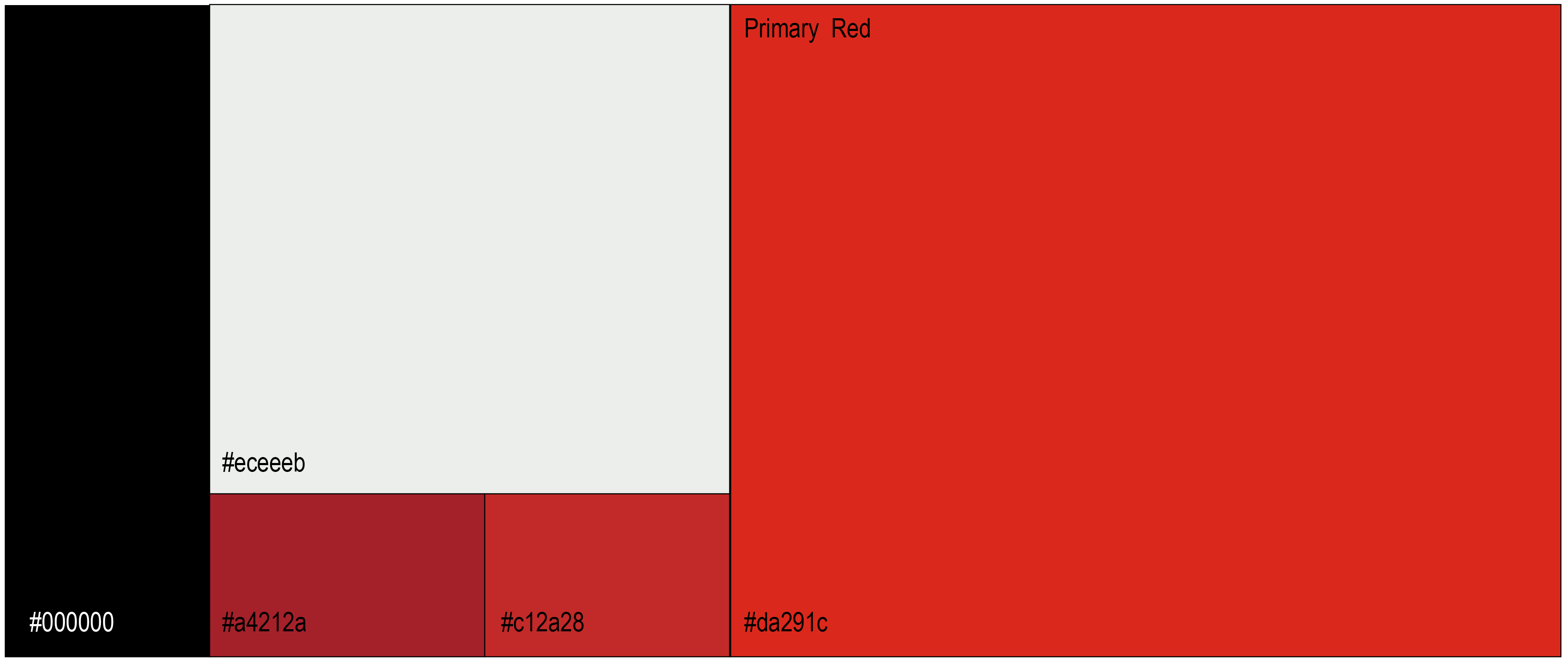
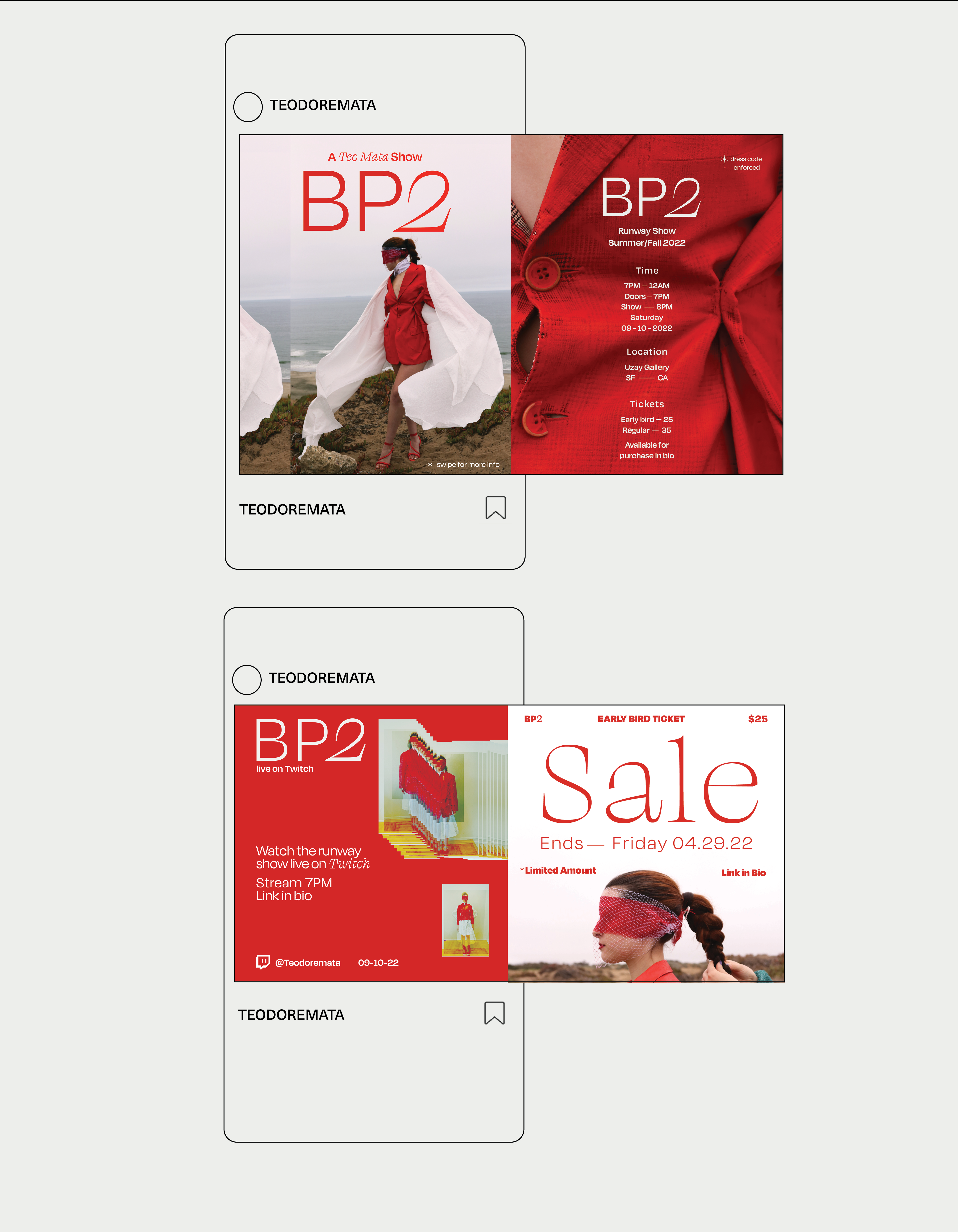
Color played a significant role in BP2's graphic language, with large minimal red spaces artfully framing text and images, creating a distinct visual impact.
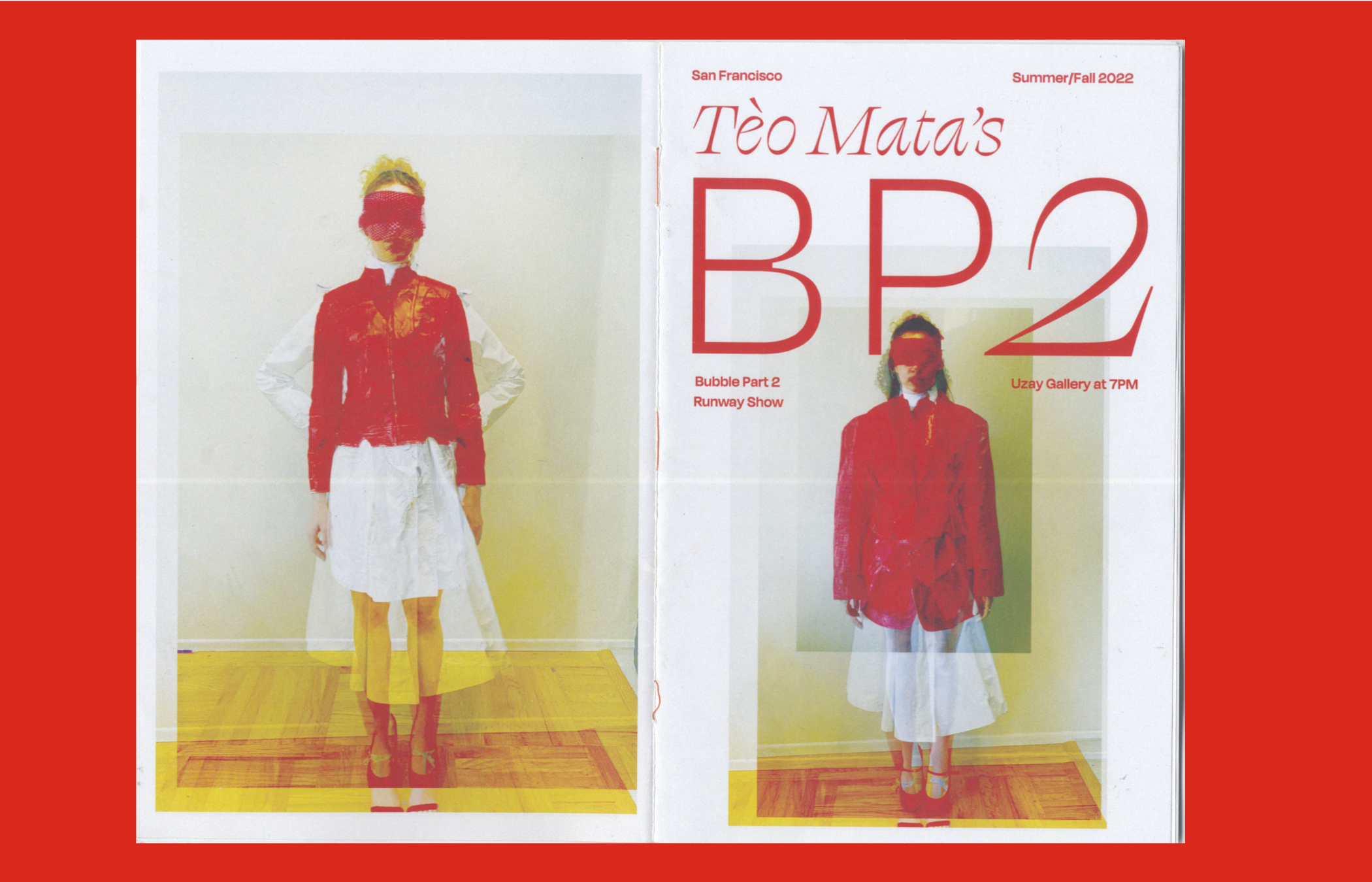
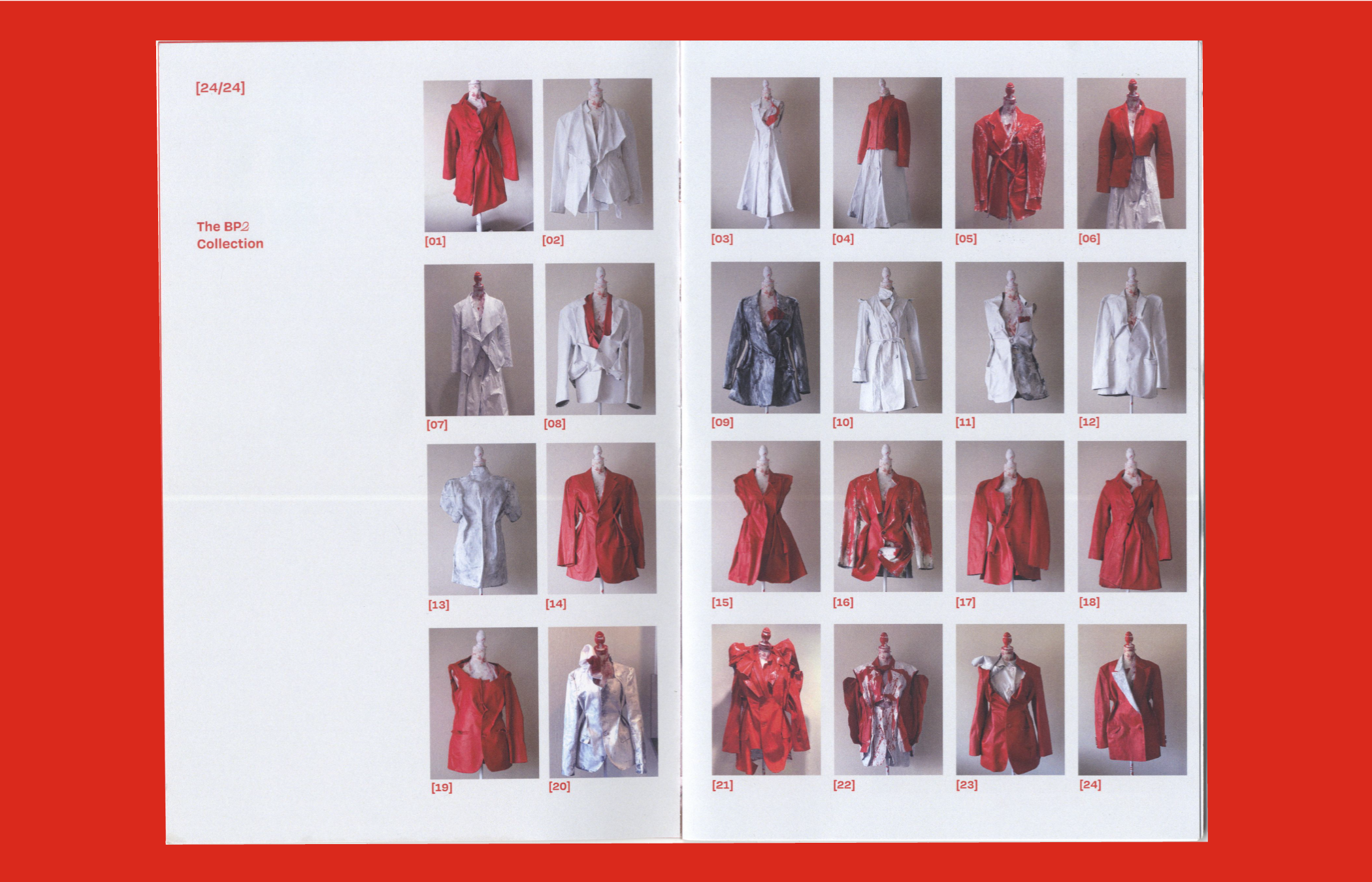
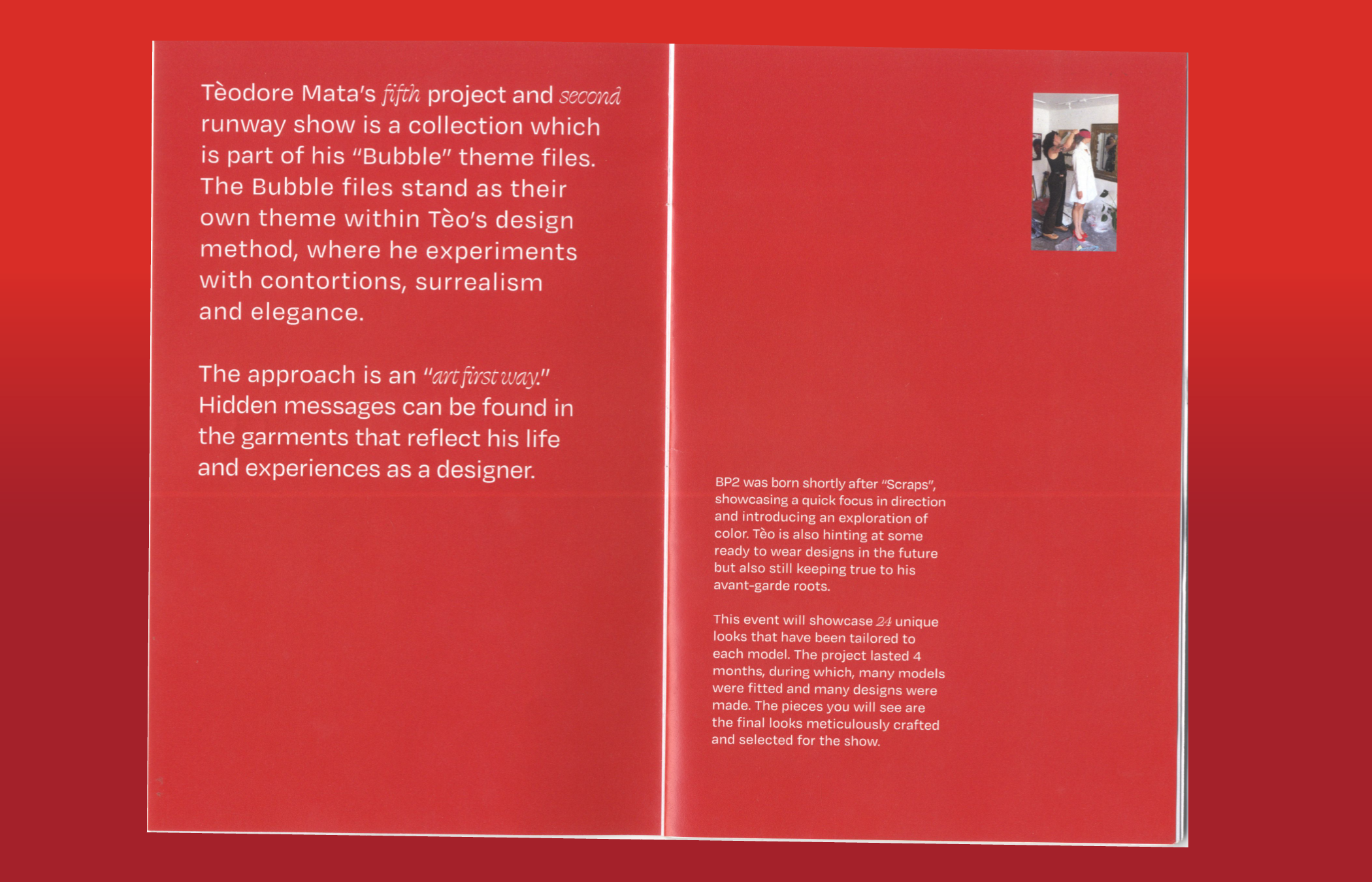
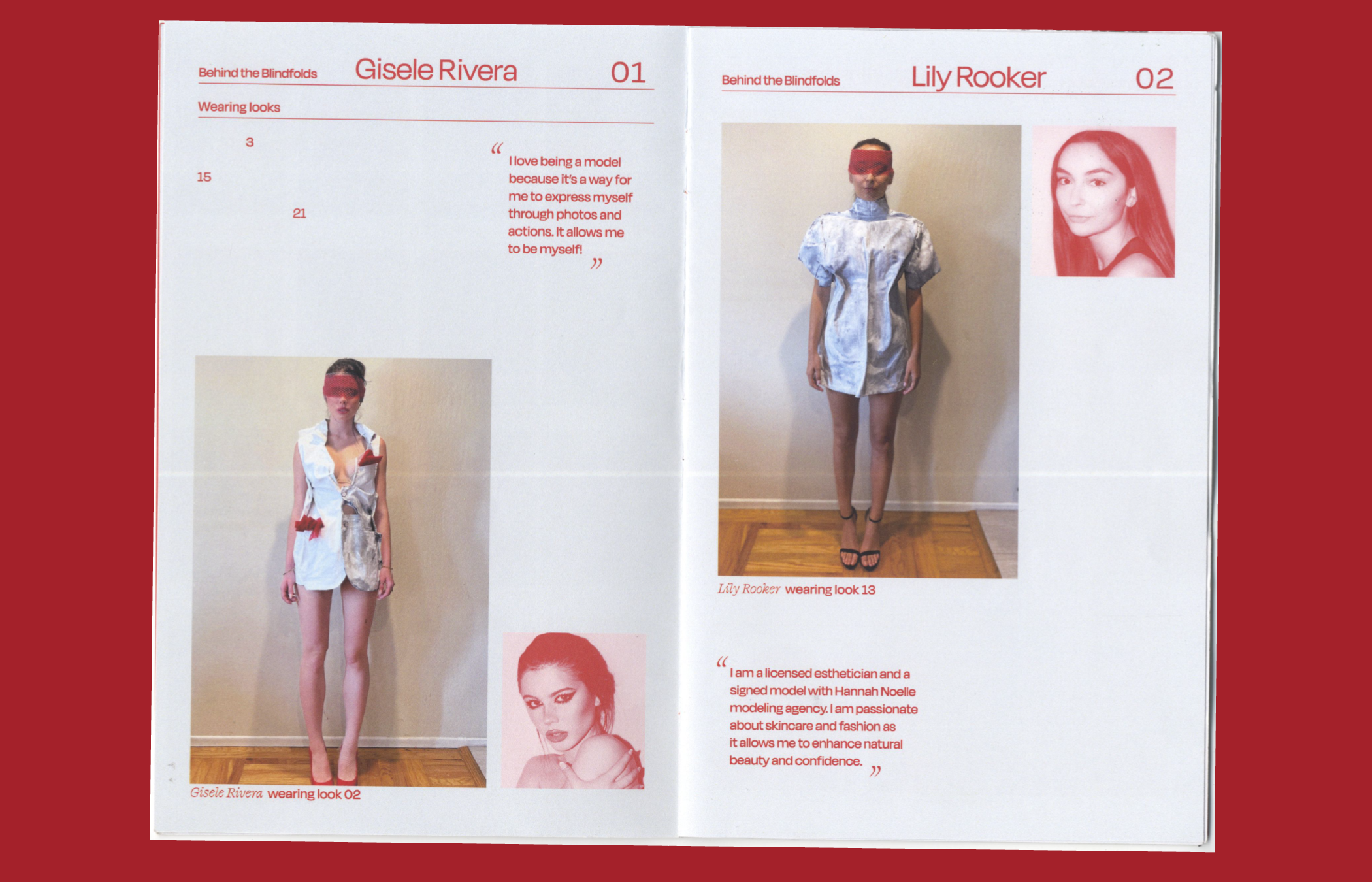
BP2's success was a result of a collaborative team effort, and it was essential to showcase the collective talent while simultaneously highlighting the collection itself. Hotspot Creative generously sponsored a print publication that delved into the models' stories and their unique creative practices. This publication, titled "Behind the Blindfold," featured insightful interviews along with detailed collection looks and exquisite craftsmanship.


04 Conclusion
BP2 embodies a design language characterized by elegance. It skillfully combines approachable sophistication with elements of contortion and surrealism.
Throughout the process, the design itself reflects the significance of teamwork and effective communication. This experience emphasized the value of individuals, fostering an environment of cohesive collaboration, peaceful interactions, and
a spirit of camaraderie.
Throughout the process, the design itself reflects the significance of teamwork and effective communication. This experience emphasized the value of individuals, fostering an environment of cohesive collaboration, peaceful interactions, and
a spirit of camaraderie.
BP2
Time — 2022
Team — Sasha Danandeh, Harmonie Malengo, Irene Yu, Michael Cravotta, Teo Mata
Type — Branding, Publiciation, Poster, Social Media

01. Background
Teo Mata, an avant-garde fashion designer from San Francisco, CA, embarked on the creative journey of his second collection, seeking a distinctive visual identity for this endeavor. He named it "BP2," an abbreviation for Bubble Part 2. BP2 encapsulates an "art-first approach" to design, fusing sculptural silhouettes with elegant details and an abundance of red.
The central question
In addressing this inquiry, we aim to craft a cohesive design language that harmoniously
blends sophistication, artistic expression, and the inherent essence of the BP2 Collection.
The central question
- How can we cultivate a visual identity that effectively supports the collection's elegance and experimental nature?
In addressing this inquiry, we aim to craft a cohesive design language that harmoniously
blends sophistication, artistic expression, and the inherent essence of the BP2 Collection.
