Emily Meyer
Time — 2024
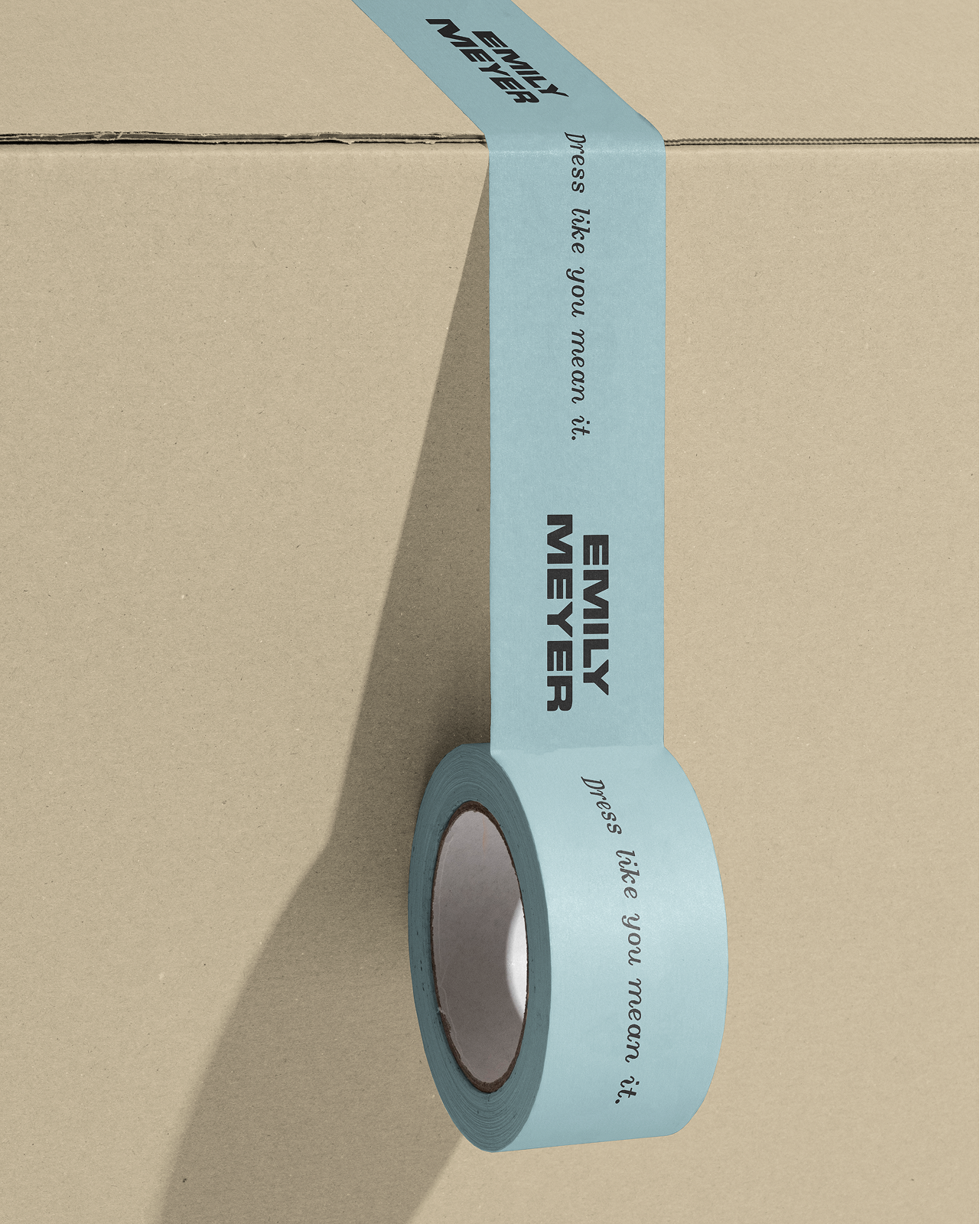
Type — Brand Identity, Print, Digital, Art Direction, Packaging Design, Website Design
Team — Cari Sekendur, Sasha Danandeh, Valentina Vergara, Nayla Al-Mamlouk, Lucas Vocos
01. Background
Emily Meyer is a bespoke tailoring brand that has been serving an often-overlooked market: women who want well-fitting, beautifully made suits. But with this rebrand, she wanted to push beyond weddings and special occasions—toward everyday suiting that feels both elevated and accessible for all.The goal: to expand her reach, enter the ready-to-wear space, and invite new customers into the world of suiting—without the elitism or stiffness the category can carry.
She came to us looking for a brand identity that felt more emotionally and visually connected to her. Her chosen word to anchor the brand was Sprezzatura—an Italian term for effortless grace. Traditionally associated with European masculinity, our challenge was to reclaim this concept and make it feel queer, modern, and inclusive.
She came to us looking for a brand identity that felt more emotionally and visually connected to her. Her chosen word to anchor the brand was Sprezzatura—an Italian term for effortless grace. Traditionally associated with European masculinity, our challenge was to reclaim this concept and make it feel queer, modern, and inclusive.


02. Process
We started by rethinking how Emily Meyer shows up—from the first impression on the website to the tactile experience of unboxing a suit.
A big part of this was rewriting the narrative around what a suit can be. No longer reserved for “girlboss moments” or wedding days, a suit by Emily Meyer is occasionwear for anywhere. We redesigned the user journey to speak to potential clients at every step: Why does this matter? What makes it unique? And how does it feel to wear something custom, made just for you?
It was important to us—and to Emily—that the new brand felt like it had movement. Her customers are doers. Movers. People in flux. We wanted the design system to reflect that confidence and energy.
03. Visuals
The new identity balances bold structure with expressive motion.
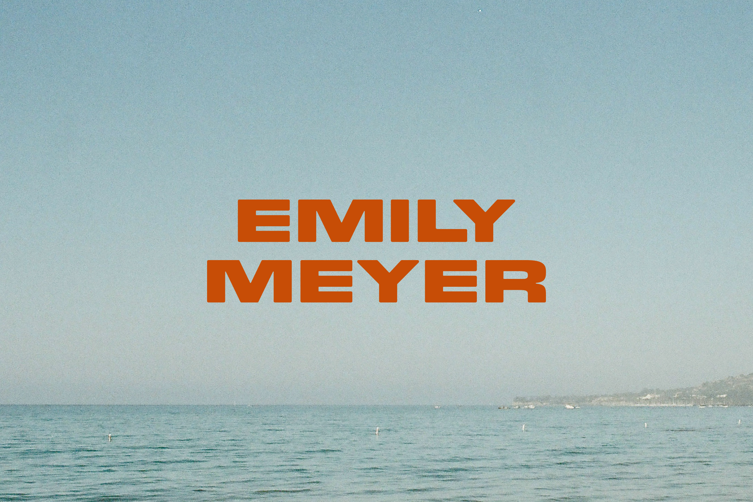
The updated wordmark uses a modernist geometric typeface—clean, grounded, and confident. This is paired with a gestural brandmark featuring a slanted “E,” and a Lion in motion, inspired by the “Dynamism of a Dog on a Leash” painting, a nod to the idea of movement and the brand’s doer spirit.
To continue the theme of motion, we used subtle blur effects across the website and printed materials. A translucent vellum envelope blurs the notecard inside. We carried these aspects of movement into the website through the use of blur, visually representing motion. We further brought this to life with text and photo animations that embody a go-getters motion through life. A favorite of mine is the sweeping text animation on the “About” page, which gives the origin story of the brand a sense of movement that matches that of their customer


03. Visuals (Continued)
The updated brand photography carries this through with models in motion—walking, reaching, doing—styled with props that suggest both action and aspiration.


04. Conclusions
Emily Meyer’s new identity reflects her mission: to open up the world of suiting to all. It’s bold but welcoming.
The brand now stands with a visual system that reflects Emily’s values—effortless, expressive, and made to move. It also connects to her emotional and personal look more
“When I first saw the brand mark, it felt like something that had been living in the back of my brain in a dusty corner. I could have never articulated it, but it’s one of the most ‘me’ things I’ve ever seen.”
More than just a visual update, the rebrand repositions suiting itself—removing it from rigid categories and inviting people to see it as a tool for movement, expression, and everyday life. It’s not just about what you wear, but how it makes you feel.
The brand now stands with a visual system that reflects Emily’s values—effortless, expressive, and made to move. It also connects to her emotional and personal look more
“When I first saw the brand mark, it felt like something that had been living in the back of my brain in a dusty corner. I could have never articulated it, but it’s one of the most ‘me’ things I’ve ever seen.”
—Emily Meyer
More than just a visual update, the rebrand repositions suiting itself—removing it from rigid categories and inviting people to see it as a tool for movement, expression, and everyday life. It’s not just about what you wear, but how it makes you feel.
Emily Meyer
Time — 2024
Type — Brand Identity, Print, Digital, Art Direction, Packaging Design, Website Design
Team — Cari Sekendur, Sasha Danandeh, Valentina Vergara, Nayla Al-Mamlouk, Lucas Vocos
01. Background
Emily Meyer is a bespoke tailoring brand that has been serving an often-overlooked market: women who want well-fitting, beautifully made suits. But with this rebrand, she wanted to push beyond weddings and special occasions—toward everyday suiting that feels elevated and accessible for all. The goal: to expand her reach, enter the ready-to-wear space, and invite new customers into the world of suiting—without the elitism or stiffness the category can carry.
She came to us looking for a brand identity that felt more emotionally and visually connected to her. Her chosen word to anchor the brand was Sprezzatura—an Italian term for effortless grace. Traditionally associated with European masculinity, our challenge was to reclaim this concept and make it feel queer, modern, and inclusive.
She came to us looking for a brand identity that felt more emotionally and visually connected to her. Her chosen word to anchor the brand was Sprezzatura—an Italian term for effortless grace. Traditionally associated with European masculinity, our challenge was to reclaim this concept and make it feel queer, modern, and inclusive.
02. Process
We started by rethinking how Emily Meyer shows up—from the first impression on the website to the tactile experience of unboxing a suit.
A big part of this was rewriting the narrative around what a suit can be. No longer reserved for “girlboss moments” or wedding days, a suit by Emily Meyer is occasionwear for anywhere. We redesigned the user journey to speak to potential clients at every step: Why does this matter? What makes it unique? And how does it feel to wear something custom, made just for you?
It was important to us—and to Emily—that the new brand felt like it had movement. Her customers are doers. Movers. People in flux. We wanted the design system to reflect that confidence and energy.
A big part of this was rewriting the narrative around what a suit can be. No longer reserved for “girlboss moments” or wedding days, a suit by Emily Meyer is occasionwear for anywhere. We redesigned the user journey to speak to potential clients at every step: Why does this matter? What makes it unique? And how does it feel to wear something custom, made just for you?
It was important to us—and to Emily—that the new brand felt like it had movement. Her customers are doers. Movers. People in flux. We wanted the design system to reflect that confidence and energy.
`
03. Visuals
The new identity balances bold structure with expressive motion.
The updated wordmark uses a modernist geometric typeface—clean, grounded, and confident. This is paired with a gestural brandmark featuring a slanted “E,” and a Lion in motion, inspired by the “Dynamism of a Dog on a Leash” painting, a nod to the idea of movement and the brand’s doer spirit.
The updated wordmark uses a modernist geometric typeface—clean, grounded, and confident. This is paired with a gestural brandmark featuring a slanted “E,” and a Lion in motion, inspired by the “Dynamism of a Dog on a Leash” painting, a nod to the idea of movement and the brand’s doer spirit.
03. Visuals (Continued)
To continue the theme of motion, we used subtle blur effects across the website and printed materials. A translucent vellum envelope blurs the notecard inside. We carried these aspects of movement into the website through the use of blur, visually representing motion. We further brought this to life with text and photo animations that embody a go-getters motion through life. A favorite of mine is the sweeping text animation on the “About” page, which gives the origin story of the brand a sense of movement that matches that of their customer

03. Visuals (Continued)
The updated brand photography carries this through with models in motion—walking, reaching, doing—styled with props that suggest both action and aspiration.
04. Conclusion
Emily Meyer’s new identity reflects her mission: to open up the world of suiting to all. It’s bold but welcoming.
The brand now stands with a visual system that reflects Emily’s values—effortless, expressive, and made to move. It also connects to her emotional and personal look more
“When I first saw the brand mark, it felt like something that had been living in the back of my brain in a dusty corner. I could have never articulated it, but it’s one of the most ‘me’ things I’ve ever seen.”
More than just a visual update, the rebrand repositions suiting itself—removing it from rigid categories and inviting people to see it as a tool for movement, expression, and everyday
life. It’s not just about what you wear, but how it makes you feel.
The brand now stands with a visual system that reflects Emily’s values—effortless, expressive, and made to move. It also connects to her emotional and personal look more
“When I first saw the brand mark, it felt like something that had been living in the back of my brain in a dusty corner. I could have never articulated it, but it’s one of the most ‘me’ things I’ve ever seen.”
—Emily Meyer
More than just a visual update, the rebrand repositions suiting itself—removing it from rigid categories and inviting people to see it as a tool for movement, expression, and everyday
life. It’s not just about what you wear, but how it makes you feel.