ORA
Time —2022
Type — Branding, Publiciation,
Poster, Web
Team — Sasha Danandeh, Elana Wallach, Jackie Baird, Hannah Chaney
01. Background
ORA is a transformative fashion brand that wanted branding to resonate with its target audience of young adults and reflect the vibrancy of its clothing designs.
Questions
Questions
- What does a compelling branding strategy entail for ORA clothing?
- How can we effectively communicate the clothing's transformative nature through design?

Molot designed by Tagir Safayev is used as the header.

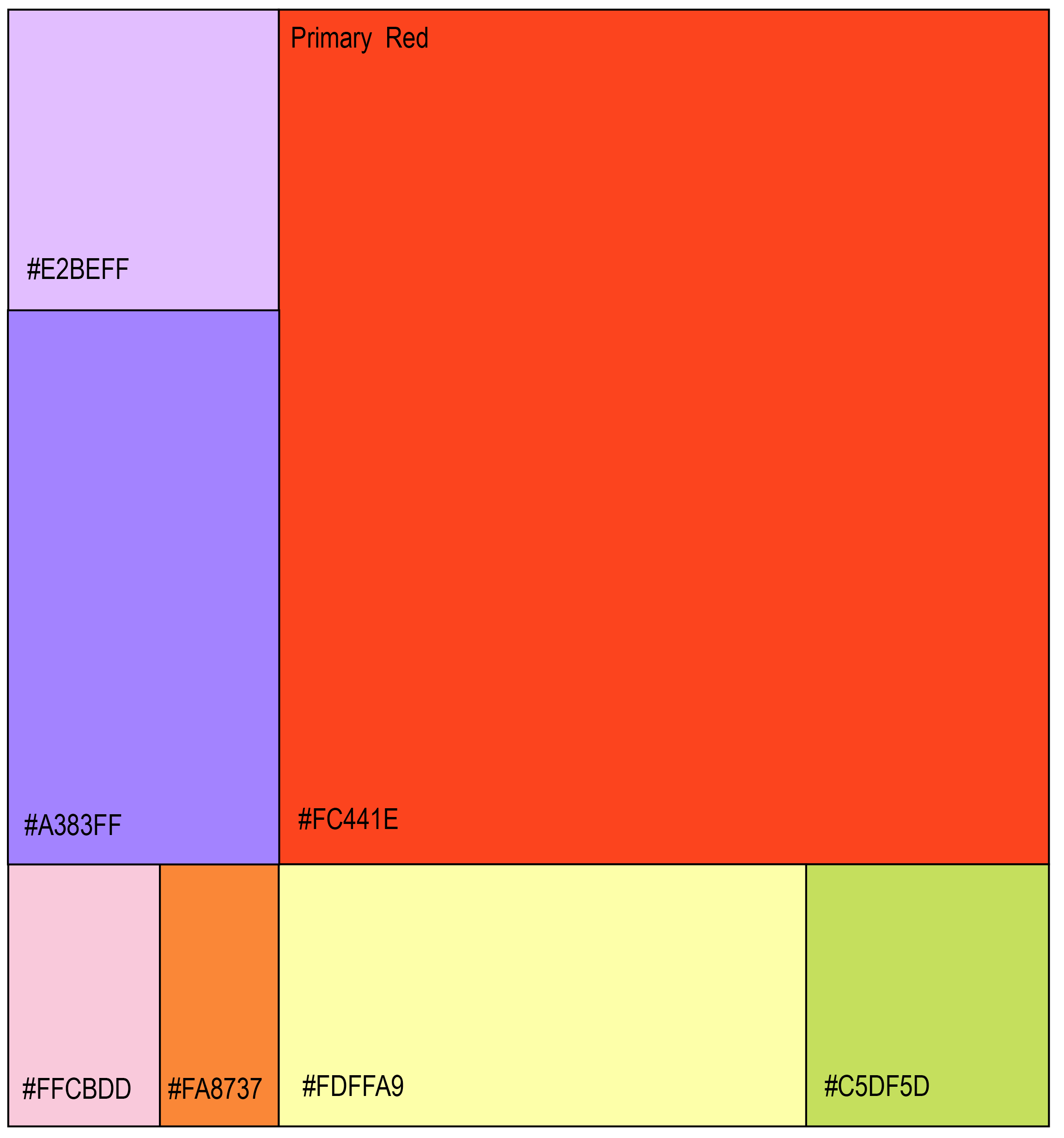
Space Grotesk designed by Florian Karsten is used as the body type.
02. Research
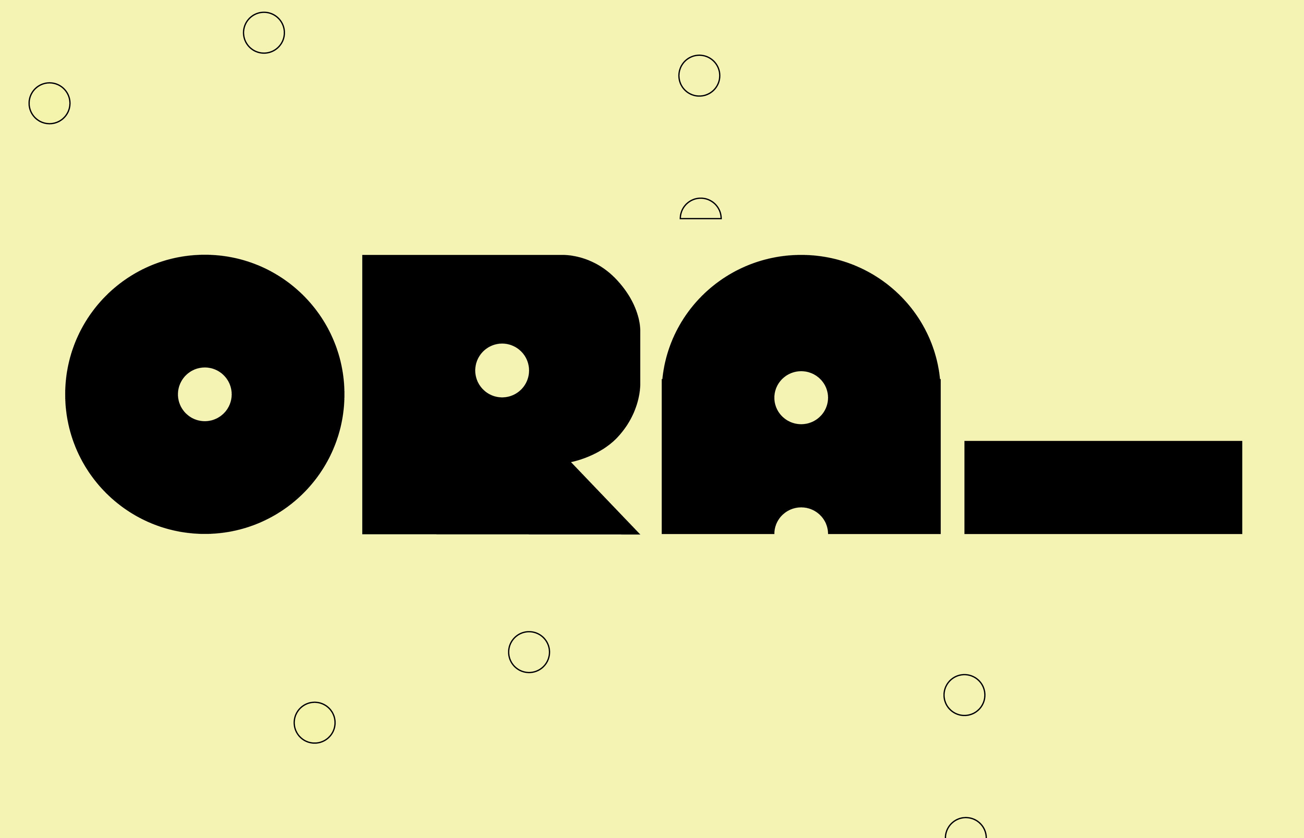
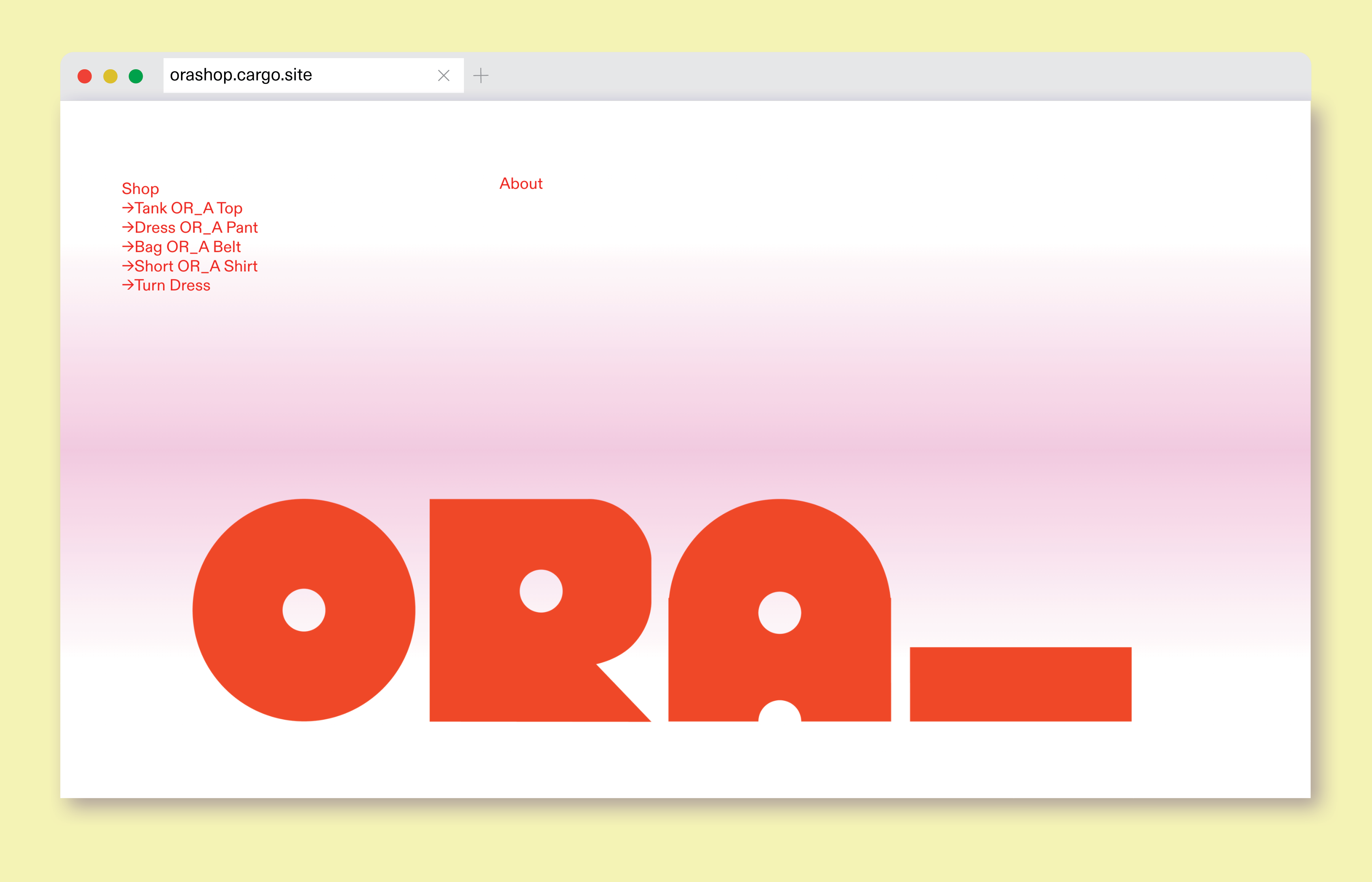
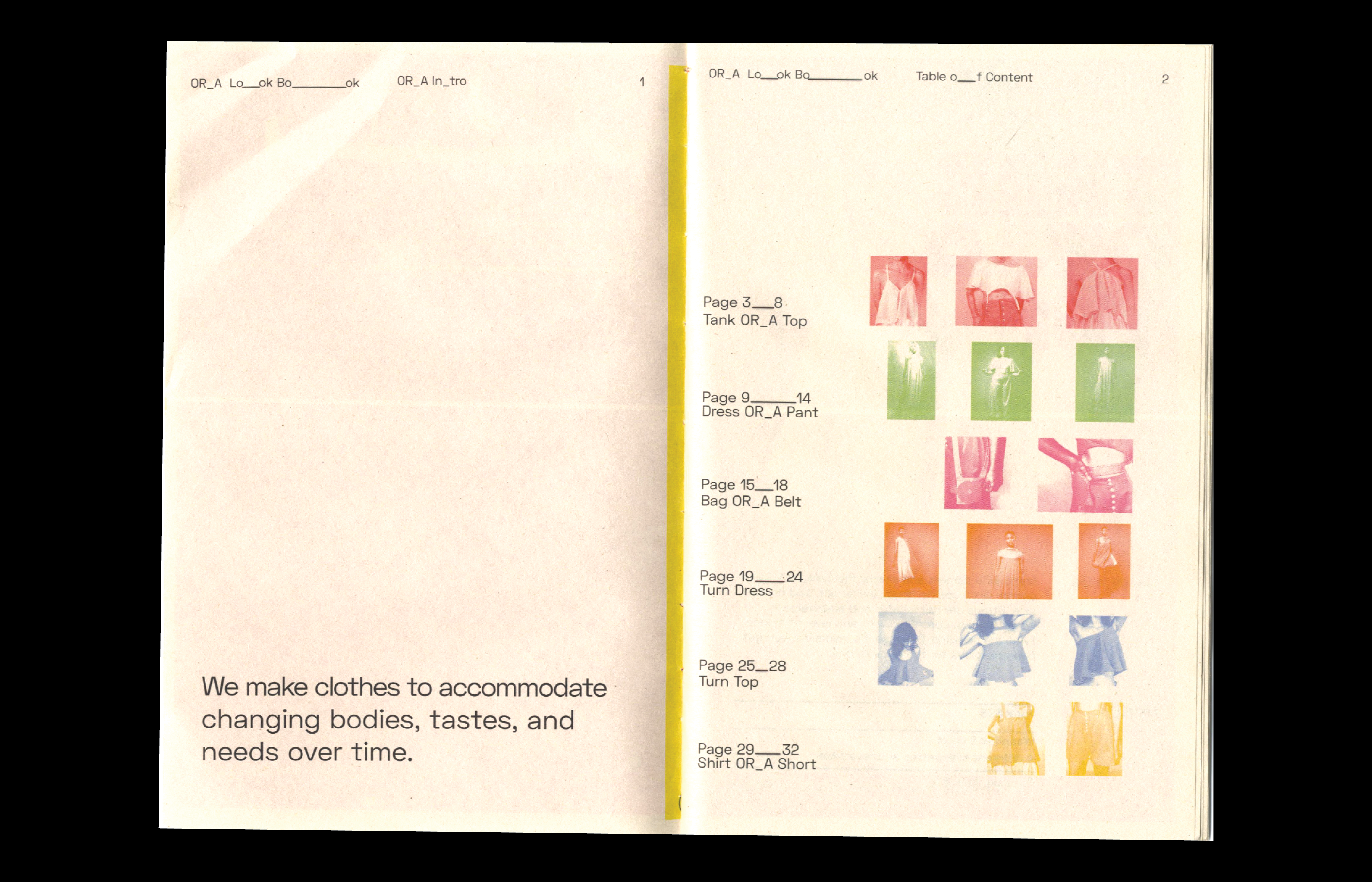
Based on initial observations on the name ORA, the design called for the potential to modify the logo from "ORA_" to "OR_A." This modification allows the logo to be seamlessly integrated into design choices, such as their product line, including the Pant OR_A Skirt.
Additionally, ORA aimed to engage and captivate their target audience of women aged 18-28. The research involved attending ORA informative booths and conducting tests with graphics by distributing free posters and instructions showcasing the transformative nature of the clothing.
Based on my research, I observed a strong affinity for vibrant and playful designs, as they complement the overall brand aesthetic.
03. Process
With signature elements like space buns, Euphoria-esque makeup, bold red accents, and pants that transform into dresses, ORA has a clear sense of identity. However, they needed graphic design to effectively showcase their unique style.
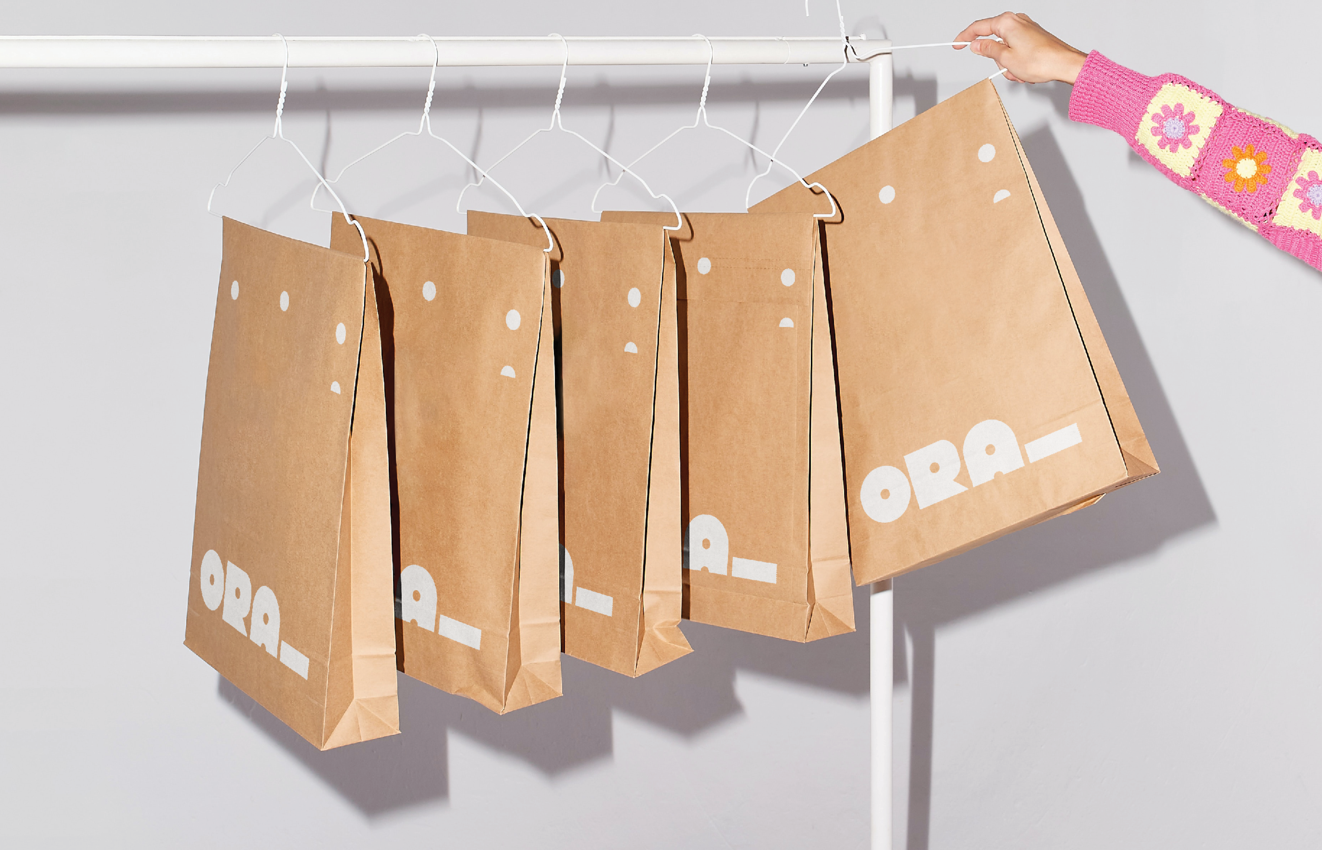
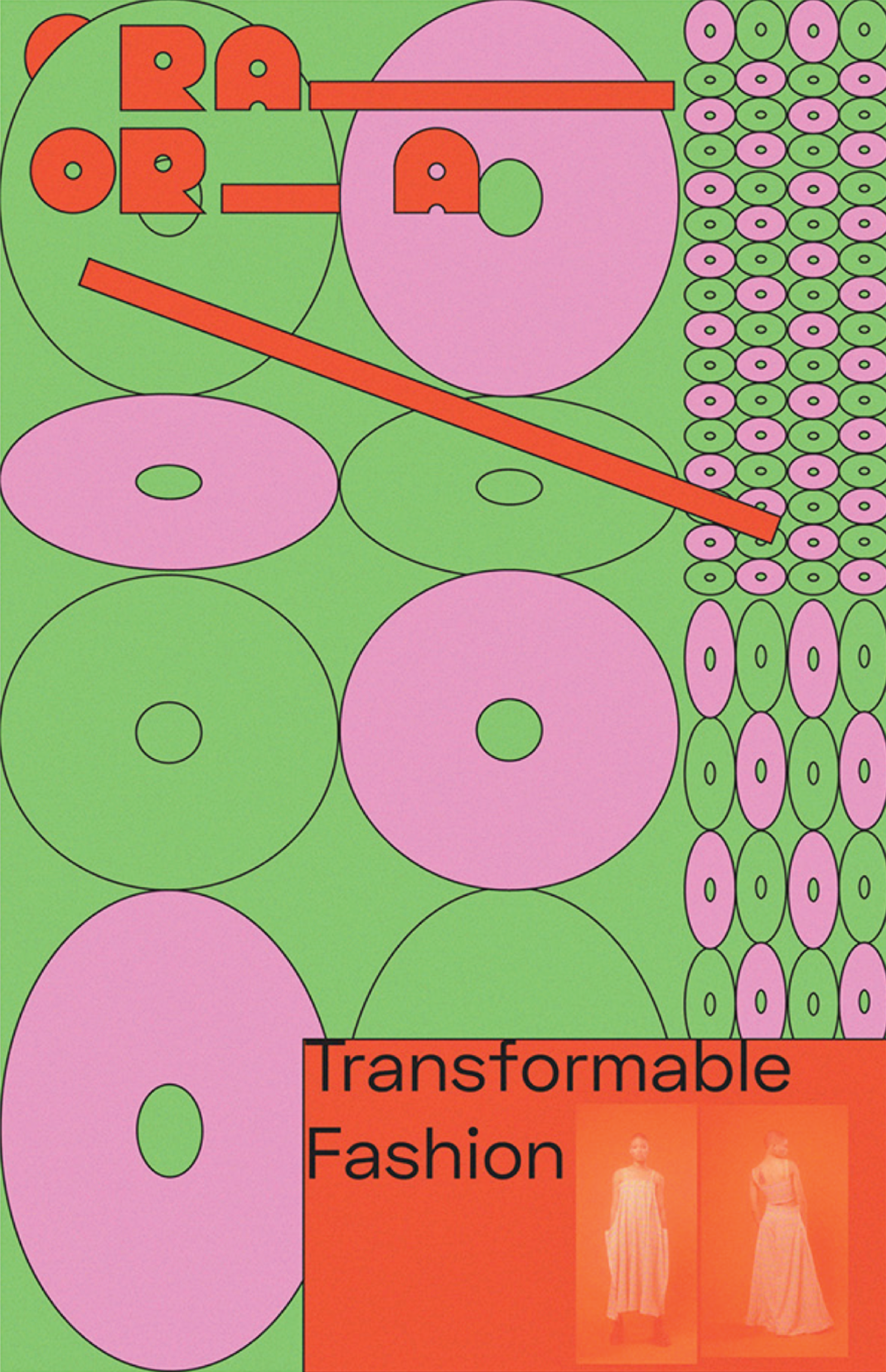
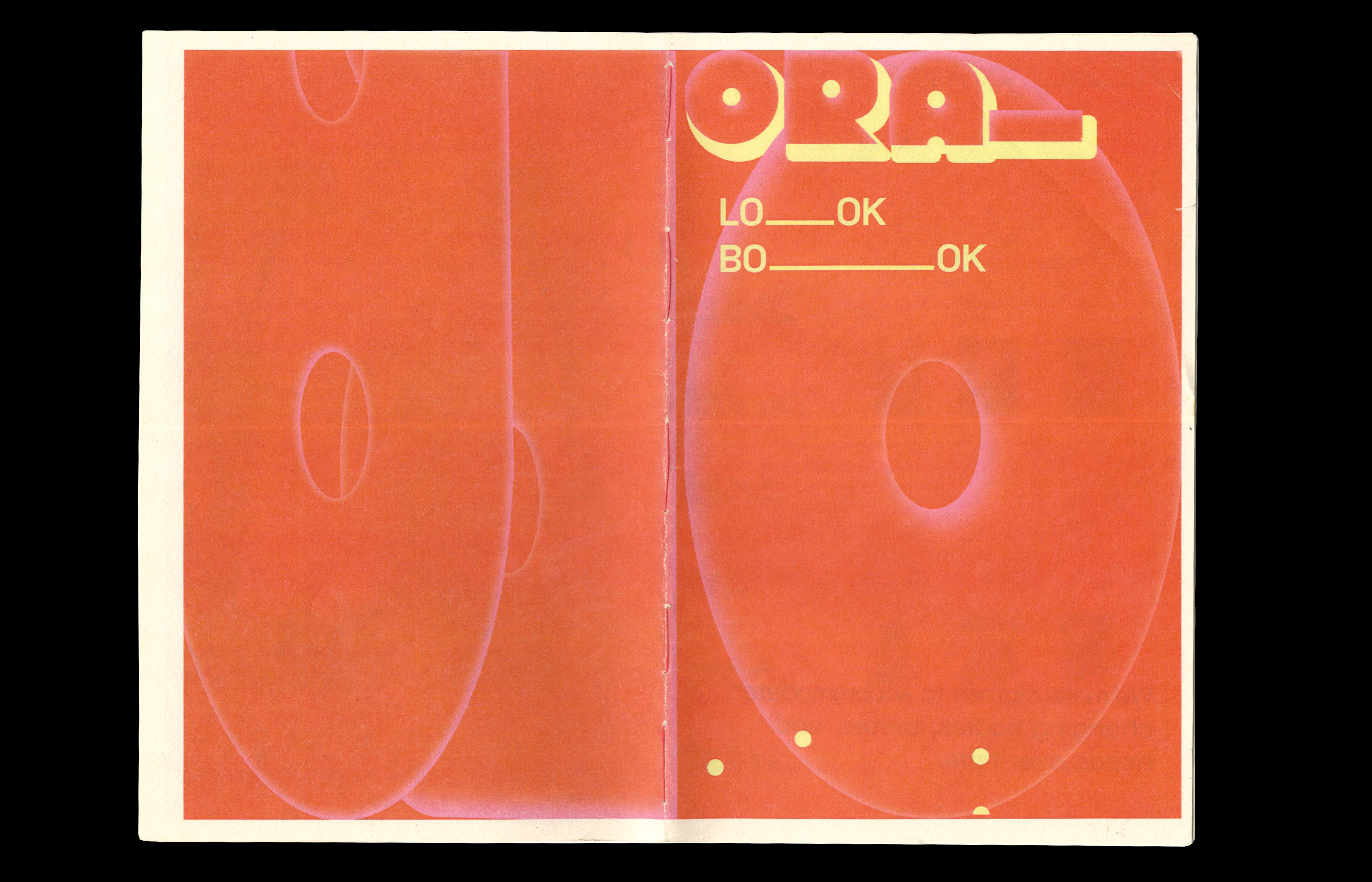
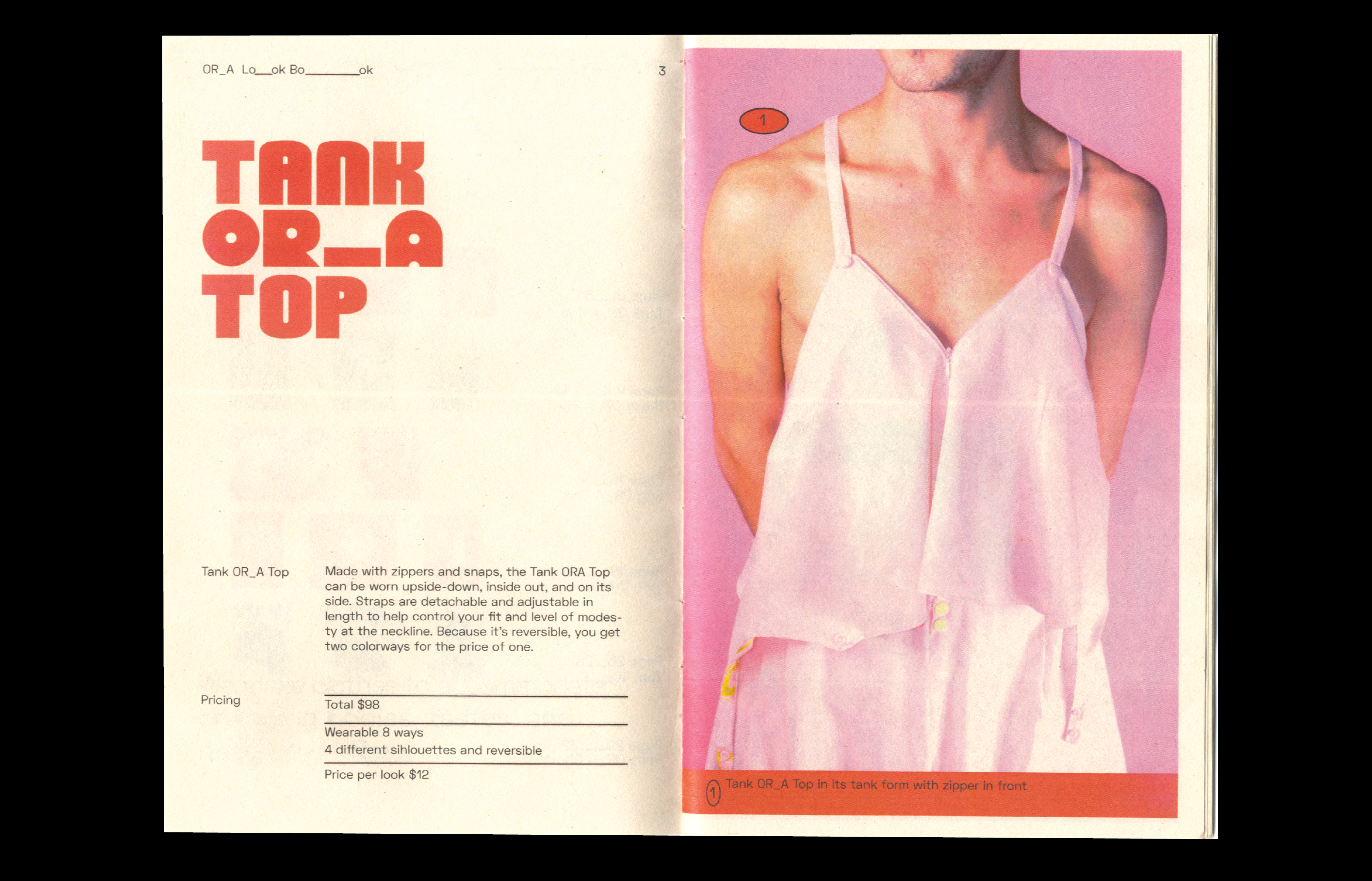
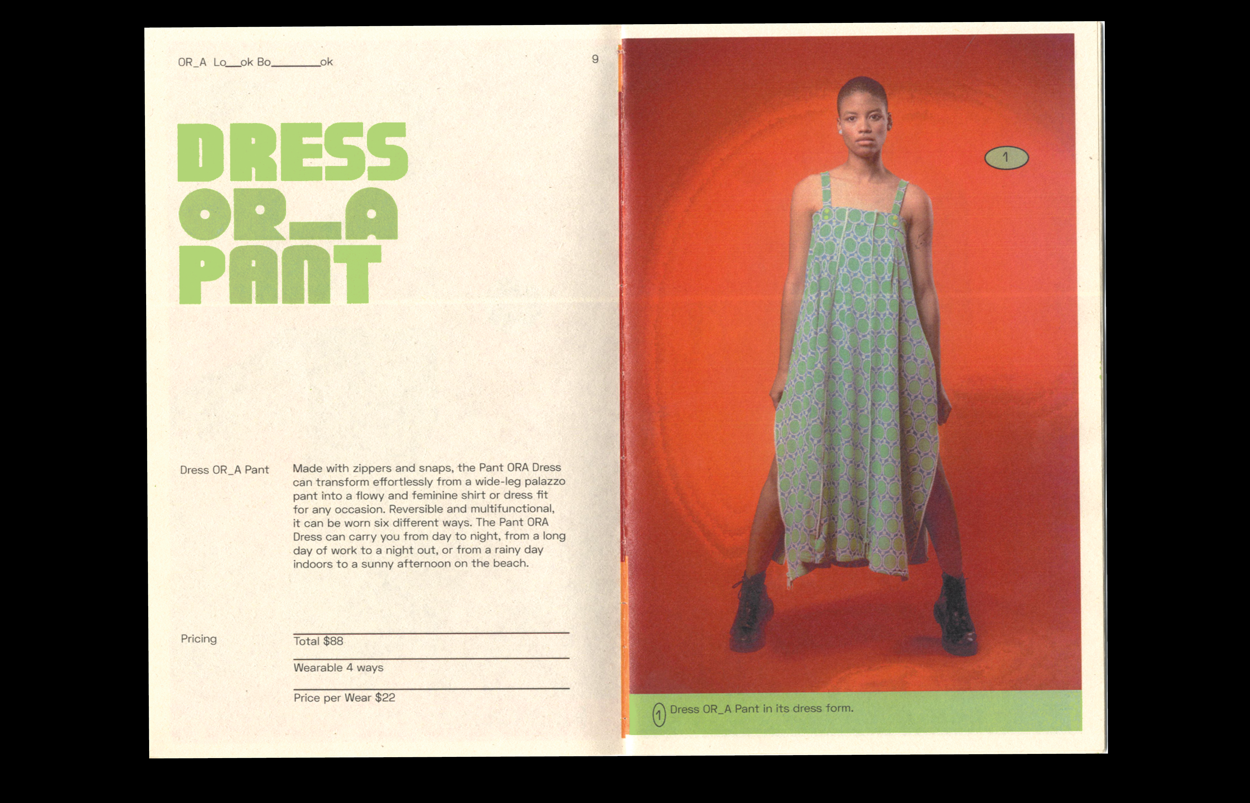
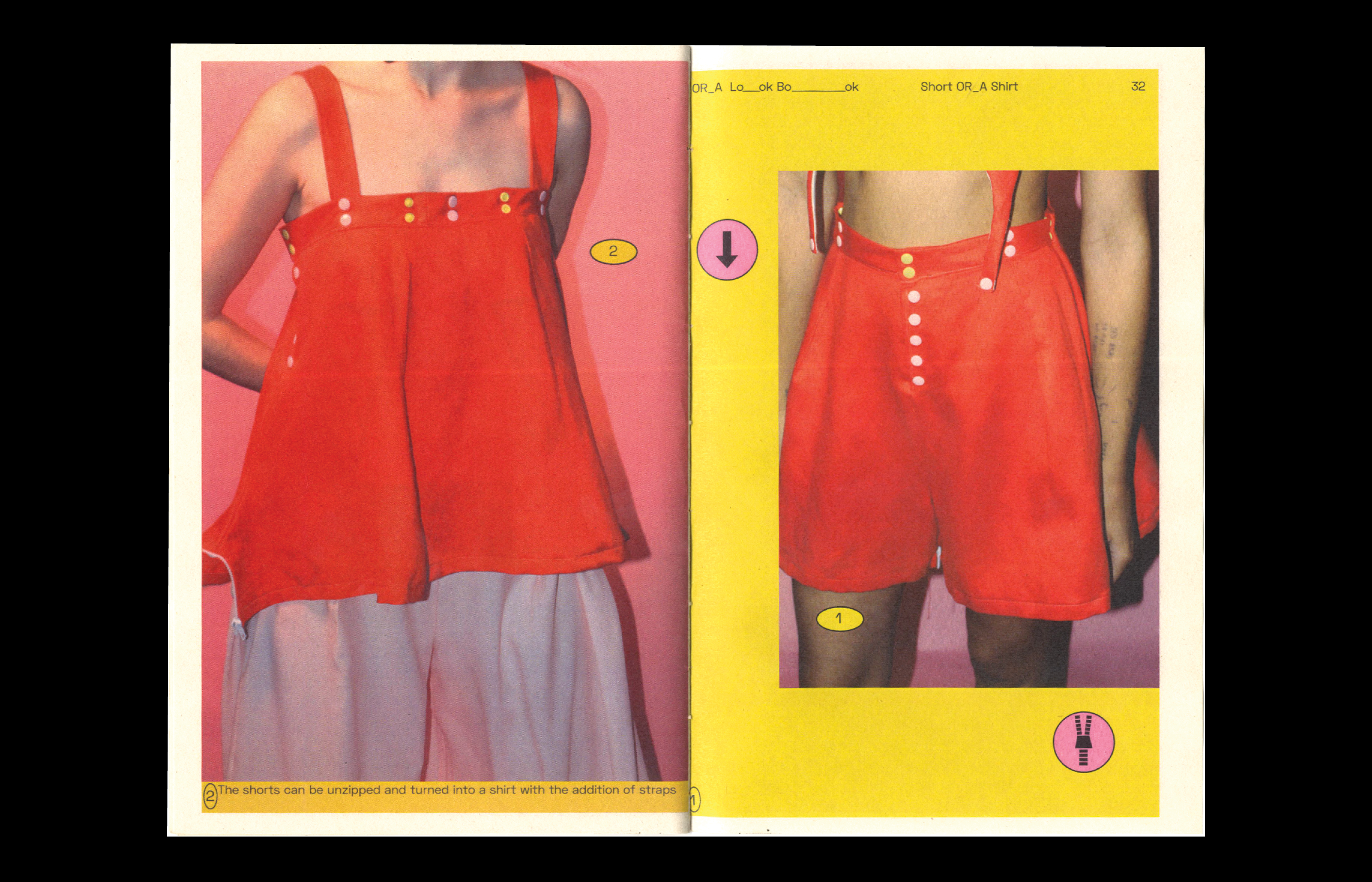
During the design process, the focus was on transformability and adaptability. Treating the logo as a versatile unit, ORA's designs incorporated a blend of shapes and typography to create dynamic graphics that complemented their clothing line. The logo utilized a blocky typeface with a consistent counter space to reflect the transformative nature of their garments, all stemming from a unified pattern.
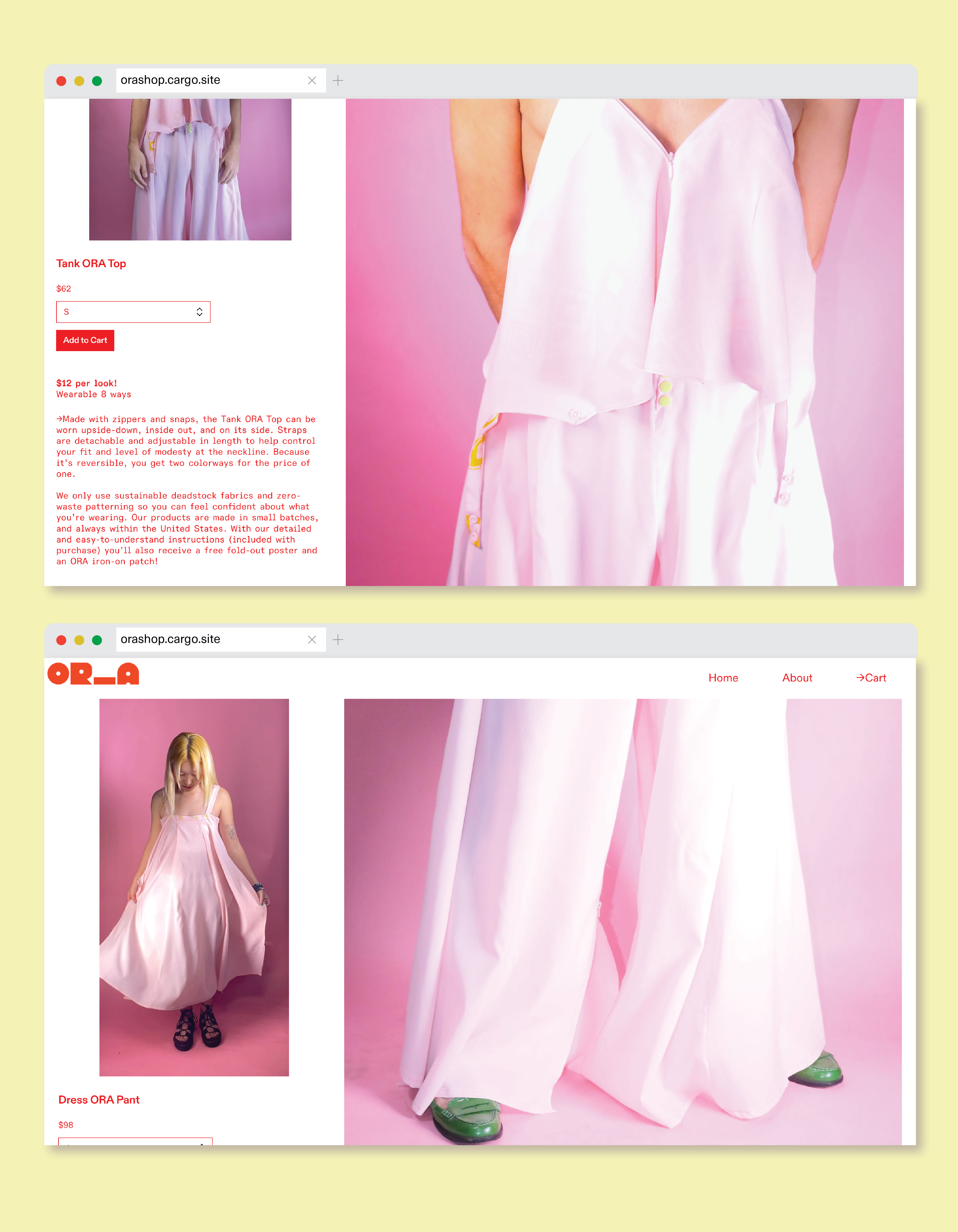
To enhance the customer experience, we revamped ORA’s online presence as an e-commerce site using the Cargo platform. We also incorporated captivating video uploads to showcase the movement and versatility of their garments to potential shoppers.
During the design process, the focus was on transformability and adaptability. Treating the logo as a versatile unit, ORA's designs incorporated a blend of shapes and typography to create dynamic graphics that complemented their clothing line. The logo utilized a blocky typeface with a consistent counter space to reflect the transformative nature of their garments, all stemming from a unified pattern.
To enhance the customer experience, we revamped ORA’s online presence as an e-commerce site using the Cargo platform. We also incorporated captivating video uploads to showcase the movement and versatility of their garments to potential shoppers.


04 Conclusion
ORA achieved a successful brand language that played a supportive role in their victory at MICA's UP/START competition. The adaptability of the design language enables it to resonate effectively with both their younger audience of buyers and their investors.
Moreover, ORA reimagines the fashion industry, challenging conventional practices and reshaping the future of budgeting with garments. They push boundaries and redefine how the industry operates, paving the way for innovative approaches in fashion.
By rethinking traditional fashion norms, ORA positions itself as a trailblazer, revolutionizing the industry and offering a fresh perspective on garment budgeting and a design language to relfect that.


ORA
Time —2022
Type — Branding, Publiciation,
Poster, Web
Poster, Web
Team — Sasha Danandeh, Elana Wallach, Jackie Baird, Hannah Chaney
01. Background
ORA is a transformative fashion brand that wanted branding to resonate with its target audience of young adults and reflect the vibrancy of its clothing designs.
Questions
Questions
- What does a compelling branding strategy entail for ORA clothing?
- How can we effectively communicate the clothing's transformative nature through design?