ROSC
Time — 2024
Type — Brand Identity, Print, Digital, Social Media, Website Design
Team — Cari Sekendur, Sasha Danandeh, Emma Piercy, Nayla Al-Mamlouk, Beth Carter
01. Background
Rosc is a venture capital fund built on a 40-year family legacy. At a moment when the VC world felt uncertain, they came to us seeking a brand identity that could honor their roots while stepping into the future. The goal: to stand apart from the sea of sameness with a design language grounded in academic rigor, trust, and a distinctly human approach to investing.
Questions
Questions
- How can a visual identity capture the balance between legacy, innovation, and the courage to take risks?
- How can we evolve Rosc’s original identity to showcase what truly sets them apart?
02. Process
We began with a deep exploration of ROSC’s values. Unlike many firms, Rosc’s strength isn’t just in numbers—it’s in connection. Their ethos is family-driven, bold but thoughtful, always balancing guts with grounded strategy.
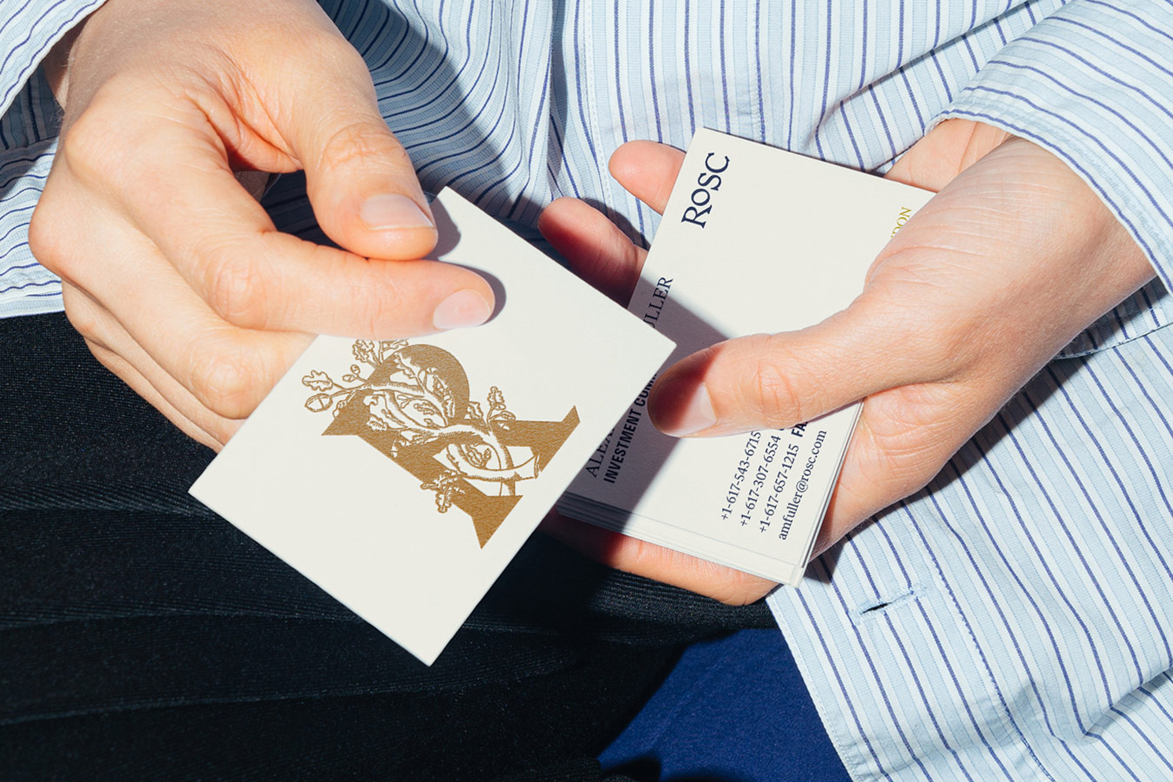
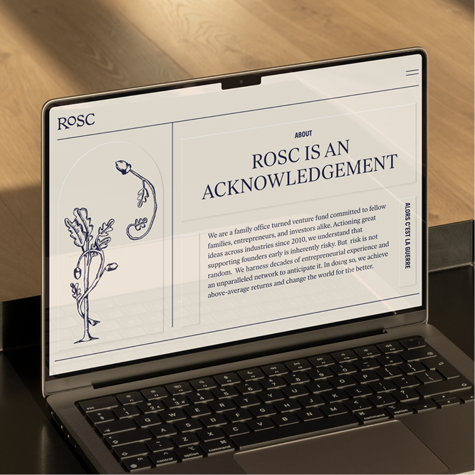
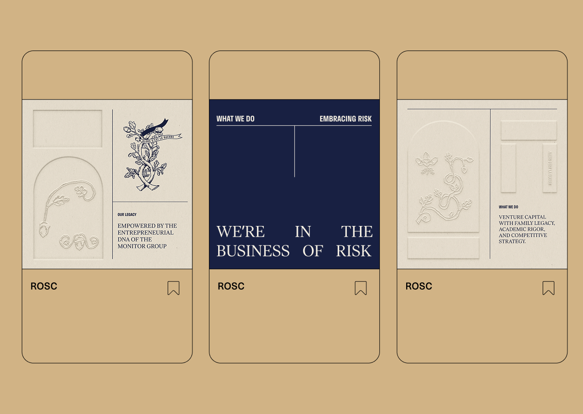
Their original acorn logo—a symbol of potential—served as our starting point. From there, we layered in new visual metaphors: the knot, for strength and interdependence; the arch, for structure and passage. These symbols became the foundation of a more nuanced, expressive brand system.
Their original acorn logo—a symbol of potential—served as our starting point. From there, we layered in new visual metaphors: the knot, for strength and interdependence; the arch, for structure and passage. These symbols became the foundation of a more nuanced, expressive brand system.
03. Visuals
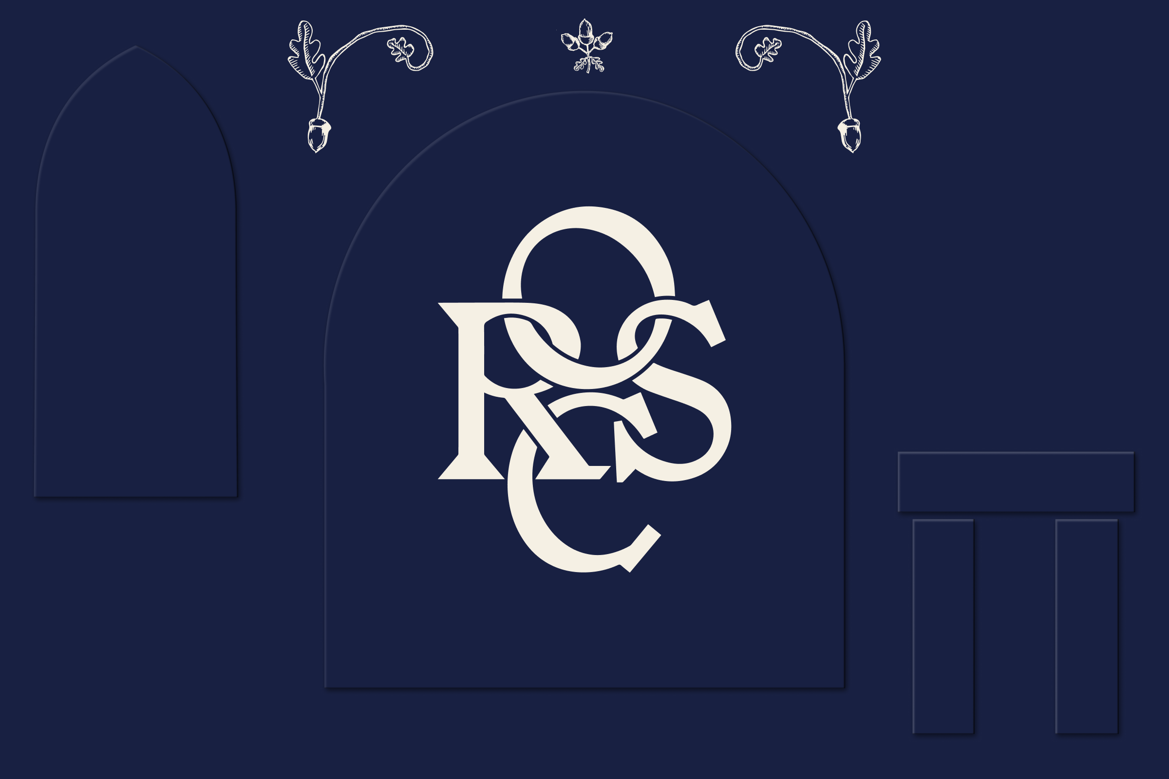
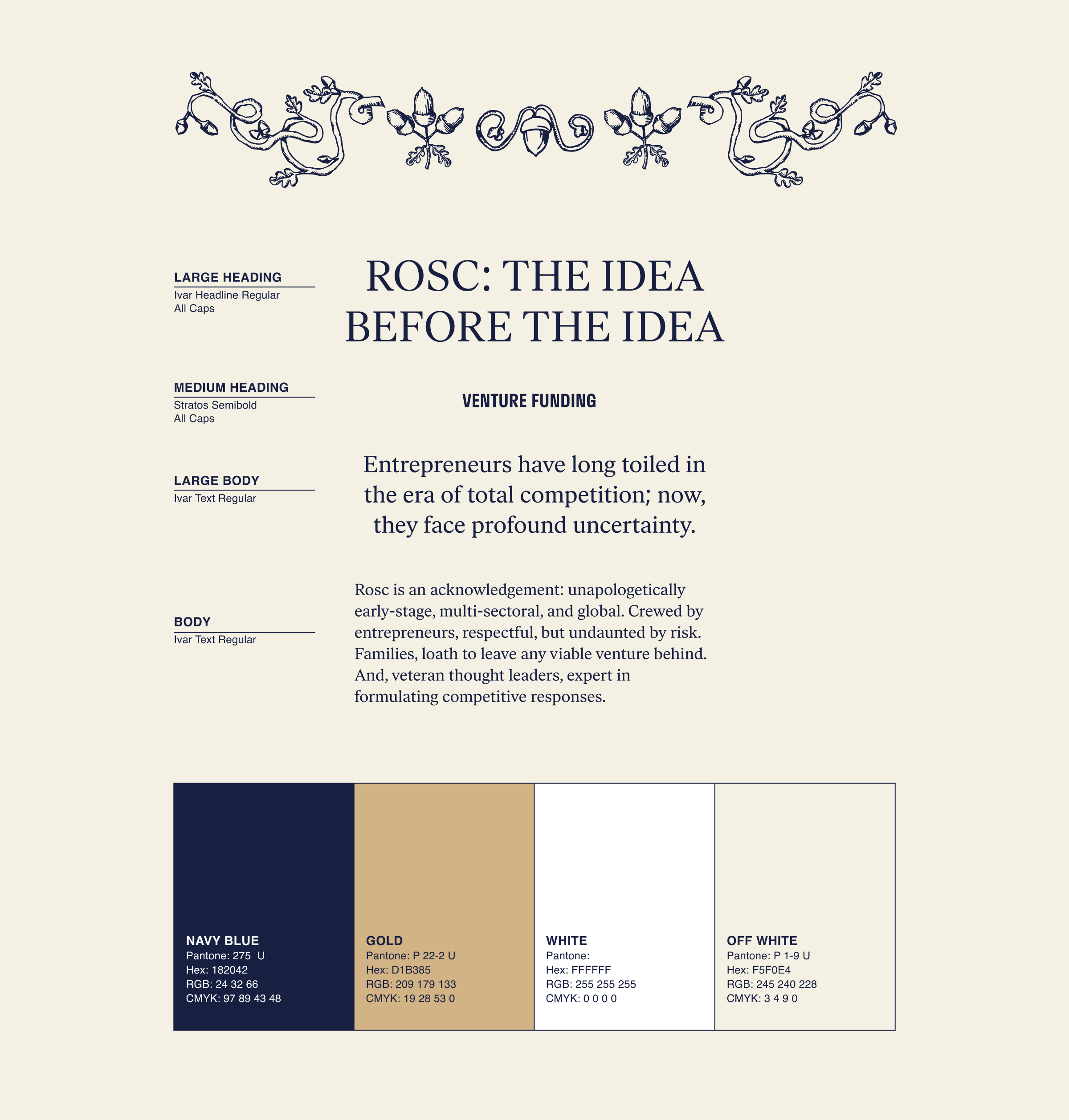
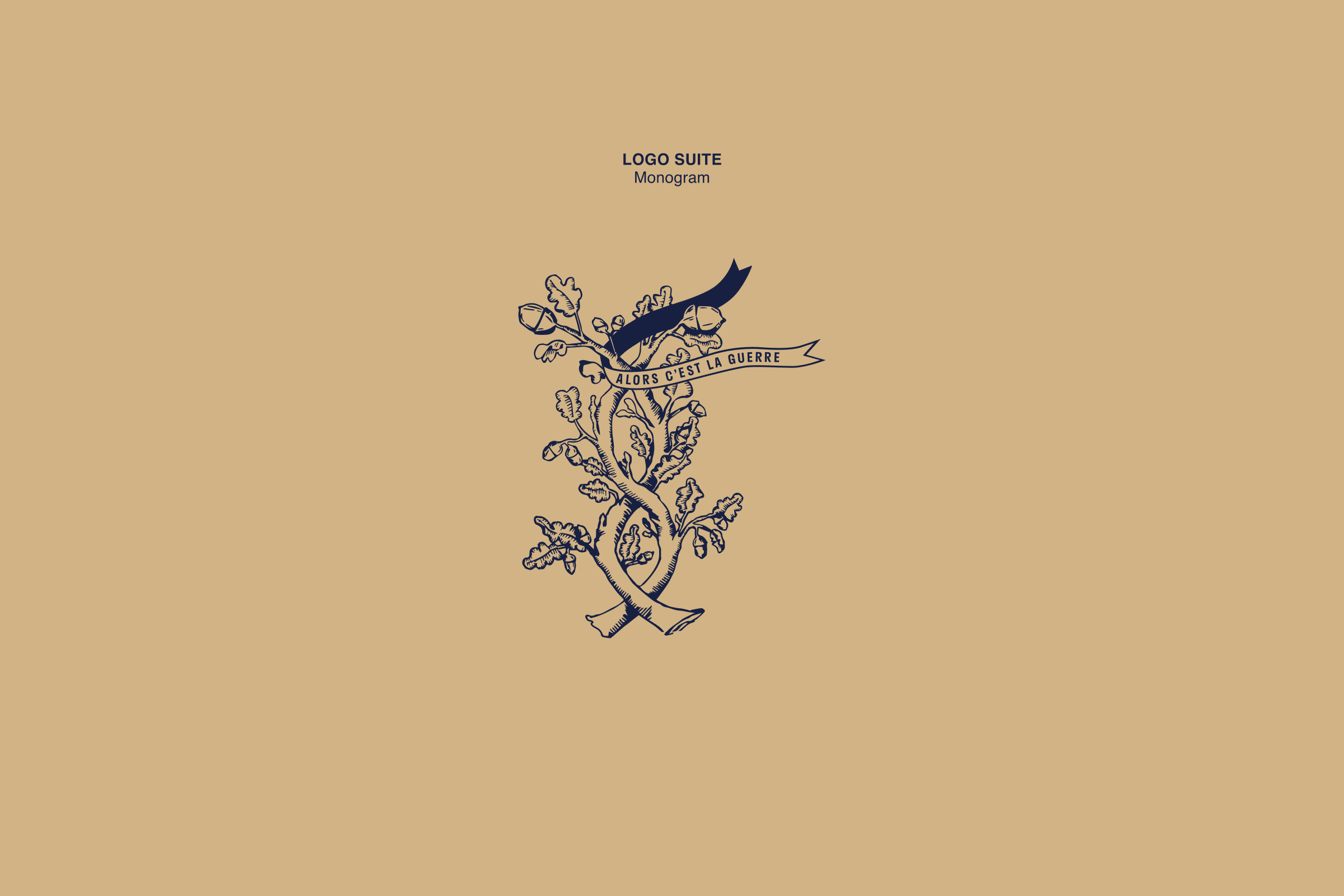
The new identity leans into a traditional linocut-inspired illustration style, showing the acorn across stages of growth—ideas taking root, then rising. Around it: arches and pillars, evoking the stability, protection, and intentionality behind each investment.
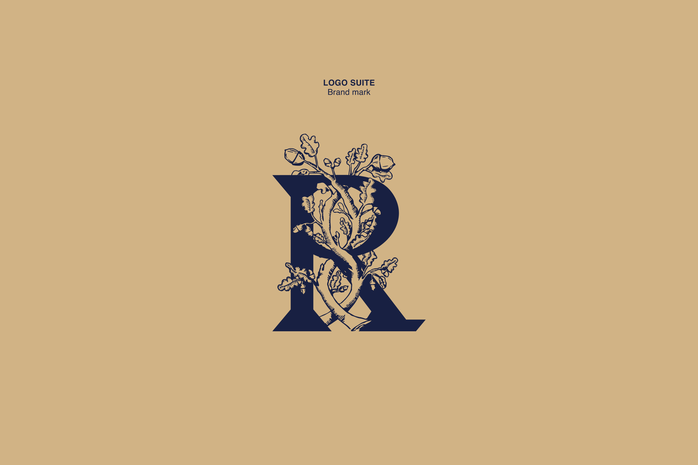
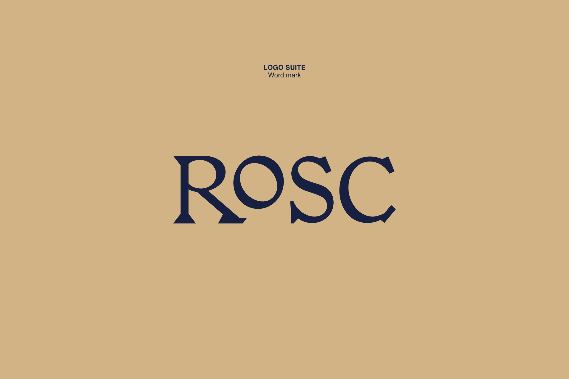
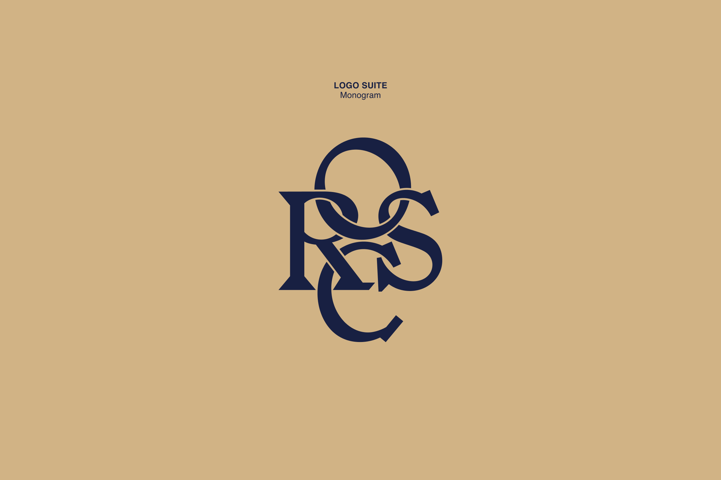
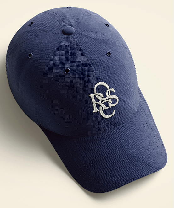
A custom monogram was designed from overlapping letterforms—arms reaching, branches interlacing—representing connection, resilience, and trust. Paired with embossed textures and classic serif typography, the system nods to heritage craftsmanship and enduring architecture. It’s where tradition meets bold new direction.
A custom monogram was designed from overlapping letterforms—arms reaching, branches interlacing—representing connection, resilience, and trust. Paired with embossed textures and classic serif typography, the system nods to heritage craftsmanship and enduring architecture. It’s where tradition meets bold new direction.


04 Conclusion
ROSC’s refreshed identity is both elegant & fearless—rooted in legacy, yet built for what’s next. Through symbolism, structure, and story, we helped express a philosophy that’s as personal as it is powerful: investing in transformation with care, courage, and conviction.
Rosc
Time — 2024
Type — Brand Identity, Print, Digital, Social Media, Website Design
Team — Cari Sekendur, Sasha Danandeh, Emma Piercy, Nayla Al-Mamlouk, Beth Carter

01. Background
Rosc is a venture capital fund built on a 40-year family legacy. At a moment when the VC world felt uncertain, they came to us seeking a brand identity that could honor their roots while stepping into the future. The goal: to stand apart from the sea of sameness with a design language grounded in academic rigor, trust, and a distinctly human approach to investing.
Questions
Questions
- How can a visual identity capture the balance between legacy, innovation, and the courage to take risks?
- How can we evolve Rosc’s original identity to showcase what truly sets them apart?

02. Process
We began with a deep exploration of Rosc’s values. Unlike many firms, Rosc’s strength isn’t just in numbers—it’s in connection.
Their ethos is family-driven, bold but thoughtful, always balancing guts with grounded strategy.
Their original acorn logo—a symbol of potential—served as our starting point. From there, we layered in new visual metaphors: the knot, for strength and interdependence; the arch, for structure and passage. These symbols became the foundation of a more nuanced, expressive brand system.
03. Visuals
The new identity leans into a traditional linocut-inspired illustration style, showing the acorn across stages of growth—ideas taking root, then rising. Around it: arches and pillars, evoking the stability, protection, and intentionality behind each investment.
A custom monogram was designed from overlapping letterforms—arms reaching, branches interlacing—representing connection, resilience, and trust. Paired with embossed textures and classic serif typography, the system nods to heritage craftsmanship and enduring architecture. It’s where tradition meets bold new direction.
A custom monogram was designed from overlapping letterforms—arms reaching, branches interlacing—representing connection, resilience, and trust. Paired with embossed textures and classic serif typography, the system nods to heritage craftsmanship and enduring architecture. It’s where tradition meets bold new direction.
04. Conclusions
ROSC’s refreshed identity is both elegant & fearless—rooted in legacy, yet built for what’s next. Through symbolism, structure, and story, we helped express a philosophy that’s as personal as it is powerful: investing in transformation with care, courage, and conviction.