Flourish
Time — 2023
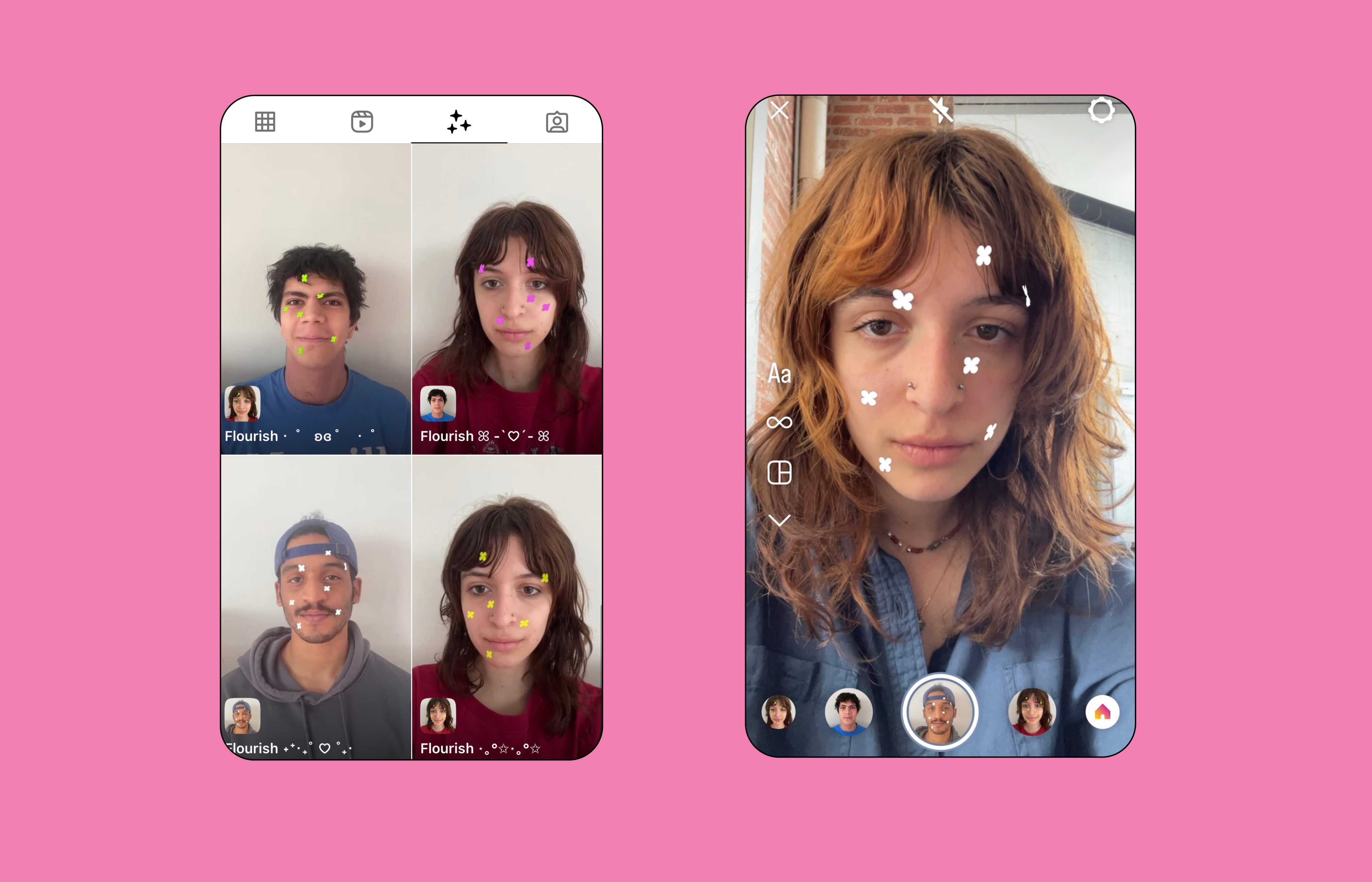
Type — Brand Identity, Publication, Print, Social Media, AR filter
Team — Sasha Danandeh, Stella Kim, Miracle Kendall, David Neri,
Tatyana Twyman

01. Background
The Office of Culture and Identity (OCI) at MICA sought a new visual identity system for their 29th Annual Benefit Fashion Show. This event showcases student-designed wearable art and raises funds to support students pursuing diversity-related art projects.
Questions
Questions
- How can we recognize the shifting ground from these last years while giving space to an era of restabilization?
- How can the design reflect unique spaces and restabilization?
02. Process
The first phase involved familiarizing ourselves with the designers and students participating in the 2023 show, as well as their respective collections. This process included reading about the collections, observing their creative process, and conducting group meetings to meet and learn about their practices.
Through the research process, the design team recognized the distinct themes of cultivation associated with each collection. These themes spanned a wide range, including a focus on hair, natural proteins, girlhood, and humor!
Through the research process, the design team recognized the distinct themes of cultivation associated with each collection. These themes spanned a wide range, including a focus on hair, natural proteins, girlhood, and humor!

03. Visuals
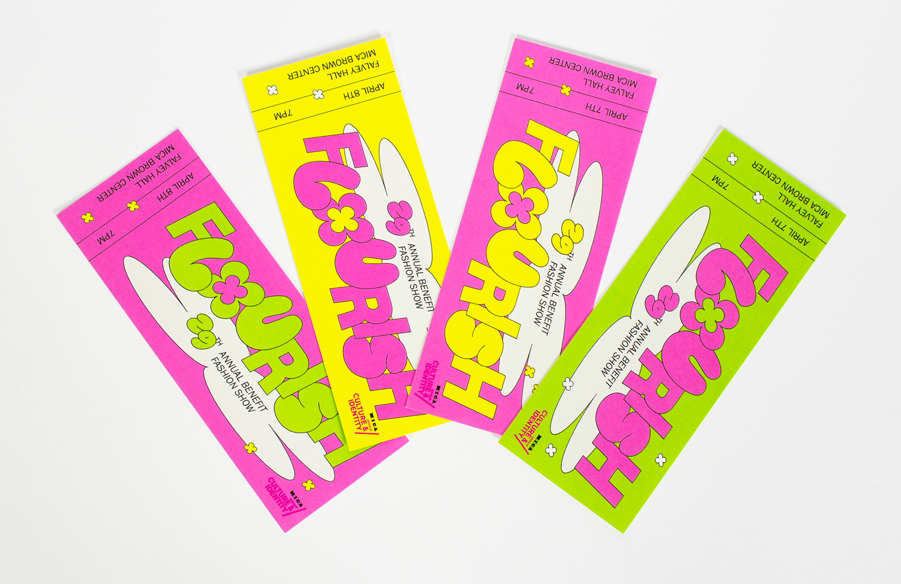
Given the unique and diverse group of collections, we developed a flexible and inclusive design language that allowed each student to personalize their display according to their distinct practice.
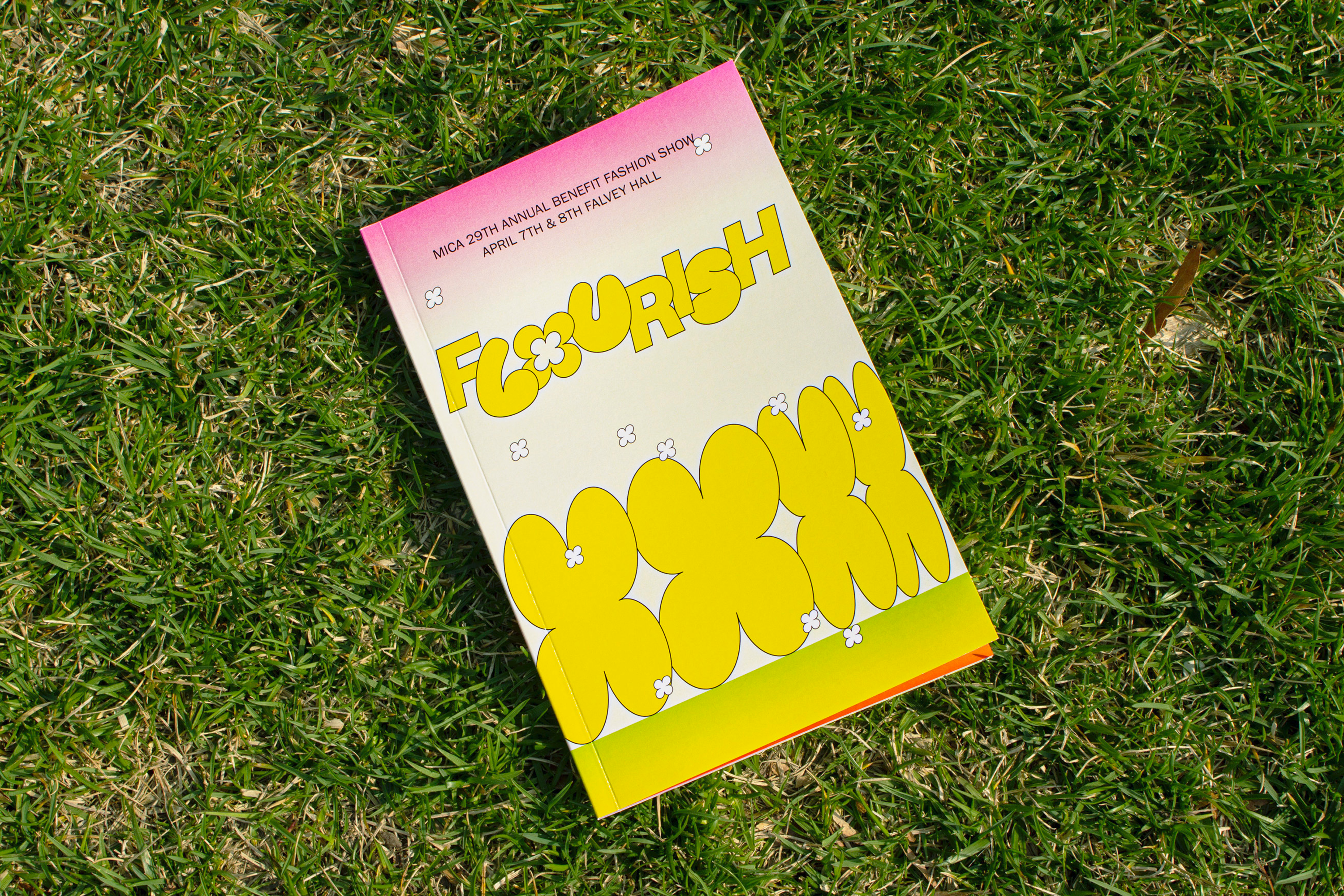
Custom typography was designed to complement Switzer, enabling us to incorporate eye-catching letter flourishes for each designer's collection name, going beyond the confines of a rigid sans-serif typeface.
Custom typography was designed to complement Switzer, enabling us to incorporate eye-catching letter flourishes for each designer's collection name, going beyond the confines of a rigid sans-serif typeface.

The header type treatment features a dynamic baseline, allowing each letter to have its own space and personifying the typography as if it embodies the unique characteristics of the artists themselves.
 Switzer is used as the header typeface, designed by Jérémie Hornus.
 Franklin Gothic URW is used as the body type, designed by Morris Fuller Benton.
03. Visuals (continued)
A diverse array of colors was carefully selected to symbolize the promising future ahead. The availability of various colors also enabled the students to choose the ones that best showcased their work, both in terms of page design and text highlighting. This approach creates an inclusive and distinctive space for the designers' creations while maintaining a cohesive and vibrant visual language throughout the show.


04. Conclusion
We successfully developed a comprehensive design system that provided each student with the freedom to express themselves uniquely in their displays. This system allowed for individualized choices and customization, ensuring that every student's vision was effectively portrayed.
Throughout this project, one of the key insights I gained was the profound significance of design. It serves as a powerful tool that gives people a voice, amplifies their expressions, and enables their creative practices to flourish. Design has the potential to empower individuals, allowing them to share their perspectives, ideas, and stories with the world.
Throughout this project, one of the key insights I gained was the profound significance of design. It serves as a powerful tool that gives people a voice, amplifies their expressions, and enables their creative practices to flourish. Design has the potential to empower individuals, allowing them to share their perspectives, ideas, and stories with the world.
Flourish
Time — 2023
Type — Brand Identity, Publication, Print, Social Media, AR filter
Team — Sasha Danandeh, Stella Kim, Miracle Kendall, David Neri,
Tatyana Twyman
Tatyana Twyman
01. Background
The Office of Culture and Identity (OCI) at MICA sought a new visual identity system for their 29th Annual Benefit Fashion Show. This event showcases student-designed wearable art and raises funds to support students pursuing diversity-related art projects.
Questions
Questions
- How can we recognize the shifting ground from these last years while giving space to an era of restabilization?
- How can the design reflect unique spaces and restabilization?